Guideline: Hi, I have used Tableau to use my data to generate a Geographic visualisation of Wind and Solar Fuel Distribution across Europe.
The reasoning for this plot have been inspired by articles [1] and [2] in an attempt to visualise patterns in the locations of these plants, and perhaps see if it is influenced by patterns in the jet stream and/or geographical location.
The visual design type was selected as a result of learning the advantages of Geo Maps from website [3].
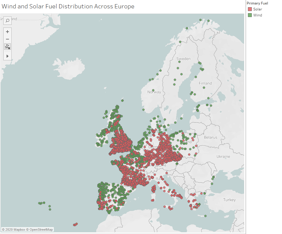
Visual Design Type: Digital / Geographic Map
Name of Tool: Tableau
Country: Europe
Year: All.
Visual Mappings:
- Detail - Name of Plant
- Color - (Green = Wind, Red = Solar)
Data Source: Global Power Plant Database - Datasets - WRI ODP
Data Preperation:
Filters
- Primary Fuel - (Wind, Solar)
- Country - (European Countries)
Information Source: Integration of wind and solar power in Europe: Assessment of flexibility requirements -
Integration of wind and solar power in Europe: Assessment of flexibility requirements - ScienceDirect [1]
Jet stream wind power as a renewable energy resource: little power, big impacts - Jet stream wind power as a renewable energy resource: little power, big impacts :: MPG.PuRe [2]
Blogs - Business Intelligence BI Dashboards Reporting Scorecards [3]
Question:
- Do you feel like the visualisation clearly displays geographical trends in wind and solar plants?
- Would you recommend any additional data to be marked to perhaps convey greater information to the user?
- Is the use of color mapping optimal?
- Would you recommend perhaps using an alternative visualisation technique that could display the desired patterns more clearly?
Thanks in advance.