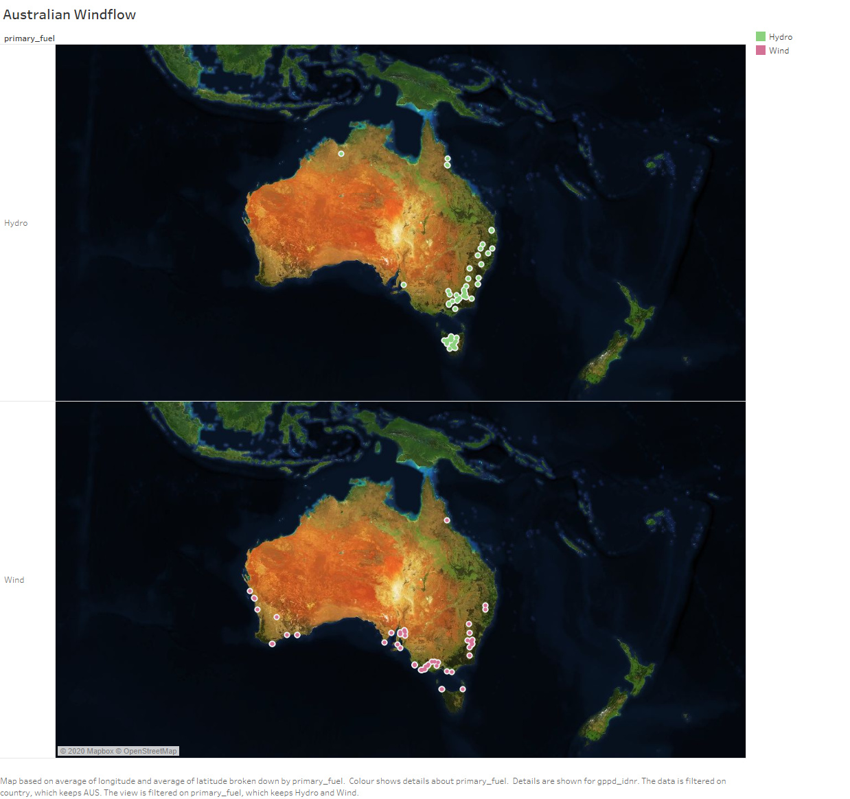
Is this a good visualisation to show the hydro and wind trend in south east australia?
The visualization of geographical locations of the wind and hydro in digital map
Visual Design Type: Digital Map
Name of Tool: Tableau
Country: Australia
Year: 2017
Visual Mappings:
X Axis: Primary Fuel Type, Latitude
Y Axis: Longitude
Colour: Fuel Type
Unique Observation: From the visualisation of a digital map above, we can see that the majority of the wind generation are by the costal. However, we can see that there are no wind farms in the mainland of Australia; this is because there is a mountain blocking the airflow to the rest of the part of Australia. Moreover, Australia utilizes the mountain by controlling the flow of the water from east to the coast and diverts through the hydropower stations.
Data Preparation: The dataset of countries has been filtered to Australia.