Guideline: Hi, thanks for giving me your time. I’m trying to visualise what are the biggest fuel sources used for power generation in the entire world and comparing the difference to others. Note: the dataset has estimated the total generation for each plant for 2014 and is last updated June 2019.
Source : Global Power Plant Database - Datasets - WRI ODP
Reference : https://www.spglobal.com/platts/en/products-services/electric-power/world-electric-power-plants-database
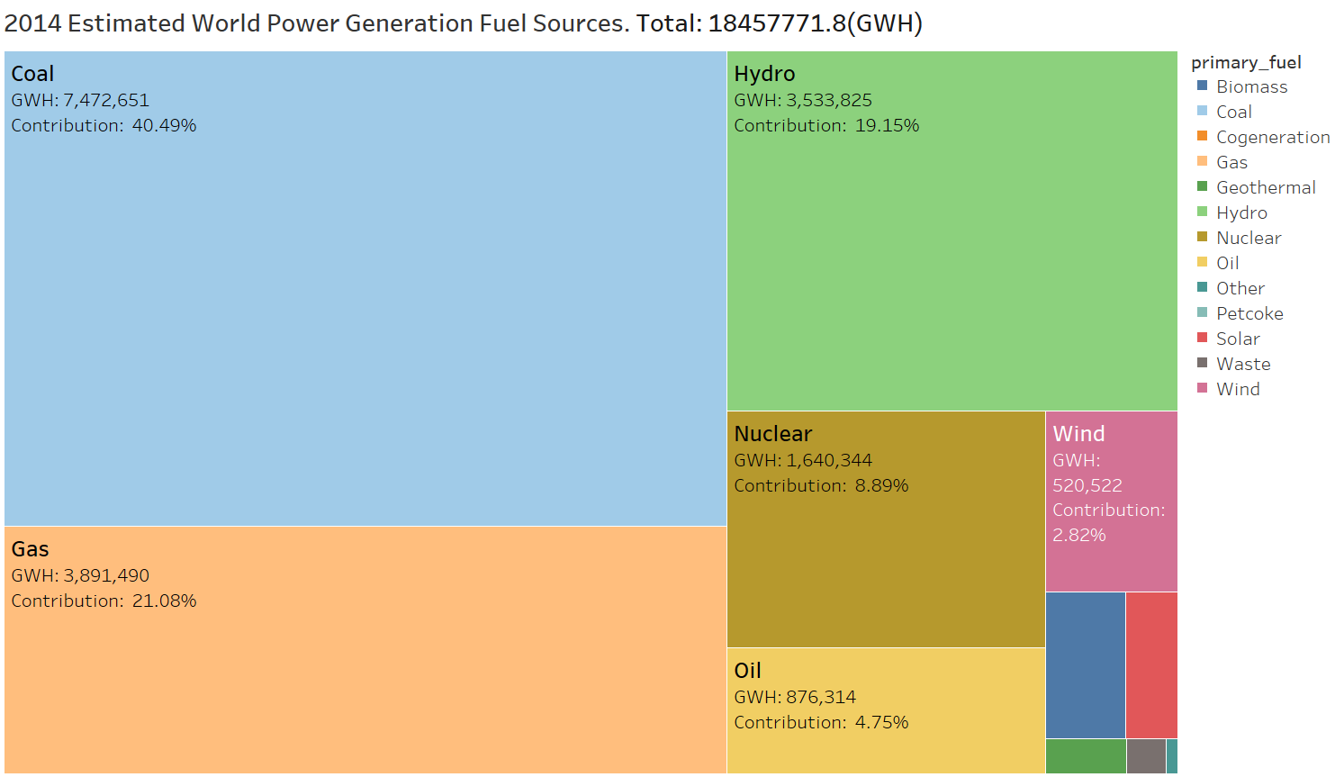
Visual Design Type: TreeMap
Name of Tool: Tableau
Country: Global
Year: 2014 Estimate
Visual Mappings:
- Square size represents the Total (GWH) for the fuel source. Ordered Largest to Smallest
- Marks on squares state fuel-type total generation and calculated percentage that the type has over the entire global generation.
- Coloring is used to distinguish each Square from another, useful for identifying unlabelled squares.
Data Preparation:
- Removed null values
- Calculated Total and percentage of each fuel source.
- Summed all plants by primary fuel source.
Unique Observation:
- Coal is the biggest source for generation accounting for over 40.5% of generated power.
- Coal and Gas (non-renewable energy) are more than half of all power generation.
- Hydro generation is the biggest renewable energy source in this data but is just half of coal generation.
- Energy generation fuel sources are not well-distributed and there exists a heavy reliance on coal.
Question:
Does it help visualise the vast difference in generation for fuel sources, if not is there a better way to compare size?
Should have I done more to integrate non-primary fuel sources( some power-plants have multiple fuel sources), if so how?