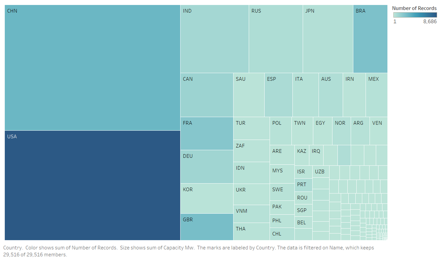
I wanted to show countries amount of recordkeeping, as well as represent the amount of capacity they have for power plants.
Source: Global Power Plant Database - Datasets - WRI ODP
Name of Tool of Creation: Tableau
Country: All recorded in data
Year: 2013 - 2017
Color: The darker the blue, the more records the country recorded for its power plants. If a node is very light the country kept less records of their power plants.
Hierarchy: What is the data hierarchy contained in the treemap? Many countries have less records than others, so they are mostly piled up in the bottom right hand corner half of the visual. Countries with an average amount of records is clumped in the top right-hand half of the visual. Countries with the most records are on the far left of the visual.
What leaf node size is mapped to? The size of the leaf node depends on the amount of records were kept. The smaller the size of the node the fewer records were kept in that country.
How are the leaf nodes laid out or positioned? The leaf nodes are organized by the amount of capacity each country has for their power plants. The bigger the node the more capacity.
Question:
Is there a better way to display the data? Maybe it be on a different type of chart, or by adding filters etc. to the existing treemap.