Hi VisGuides User!
My name is Martin Griffiths, I’m a third year student at Swansea University and I’m currently studying Data Visualisation. Our task is to find interesting and unique observations within a provided data-set. The following includes an example I made involving renewable power plants and how efficient they can be. Please enjoy the following and would appreciate advice and criticism about the visualisation. If you can, please help by answering the questions at the end of the post.
Thanks!
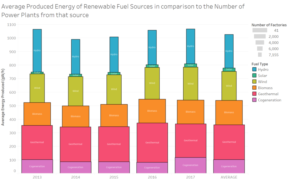
| Image Title | Average Produced Energy of Renewable Fuel Sources in comparison to the Number of Power Plants from that source |
|---|---|
| Visual Design Type | Stacked Bars |
| Name of Tool | Tableau |
| Countries | All |
| Year | 2013, 2014, 2015, 2016, 2017, Average |
| Visual Mappings | Colour : Fuel Type; Width of Bar : Number of factories; X axis : Years; Y axis : Average produced energy |
| Data Preparation | Filtered out all unrenewable fuel sources. |
| Data Set Used | Global Power Plant Database - Datasets - WRI ODP |
| Observations | What’s telling from this image is how efficient some sources are with how many factories they have. What’s most notable is the inefficiency of solar sources. They have a large proportion of plants, yet they can’t produce much energy on average in comparison to other sources. Geothermal and Hydro are clearly quite consistently good in comparison, despite Hydro having more factories. Essentially, we can assume that Geothermal is consistently high as there are less factories, and Solar is extremely inefficient. This doesn’t tell the whole story though as this doesn’t consider the size of the plants themselves nor how expensive they are to build including their payback time. A follow on question might be to understand the physical size of these plants and correlate them with payback time. Does having bigger plants mean there is better payback time, or are there certain sources that are not worth using like we might assume solar energy to be. |
Does my visual design make sense?
Is my choice of visualisation optimal for this data? Are there any other types of visual layouts that would be better for this challenge?
How can my visual design be improved?
Is there any oversights or mistakes that needs to be noted either aesthetically or factually?
Thanks again,
Martin Griffiths