Hello, I am a Swansea University student (I am sure you’ve seen many of us around), and this my hierarchical treemap.
Tool: Tableau
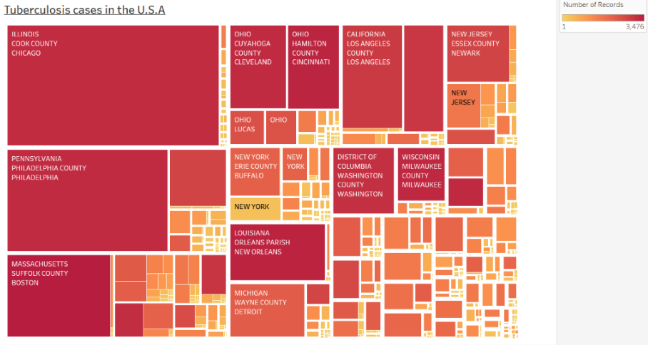
Country: U.S.A
DOI: 10.25337/T7/ptycho.v2.0/US.56717001
Disease: Tuberculosis
Visual Mappings:
-Colour: Number of records
-Shape: Count Value
-Position: From the upper left to the lower right, the count value decreases.
-Hierarchy: State → County-> City
Data Preparation: I have filtered all the results that would give the value “NA”.
I was wondering if I could get any feedback regarding the visualisation of the data. I have noticed that the labeling is inconsistent and that there are some inequalities, especially looking at Illinois. However it was the best I could think of with the dataset given. I’ve tried reducing the number of states but the inconsistent labeling issue still occurs.
Thank you in advance.
What is “Count Value”? Is the 3rd level “City” encoded in the treemap? I guess that this treemap allows users to see (i) a large number of records vs a small number of records, (ii) a large count value vs a small count value, (iii) the name of the state with a large count value. Would the users want to see also, e.g., (iv) the name of the state with a large number of records, or (v) the ratio of number of records over count value? Perhaps these requirements are beyond what your class lecturer asked you to do.
Sorry for not being more clear, count value is the number of people infected. I was thinking of displaying the State with the largest count value (hence why I used it as the size), while also showing which county/city has the majority of the infected rate within their respective States.
One thing you could add to make the visualisation clearer to see is colour code each state with its own unique colour. This would allow you and others to easily identify each block using a legend/key alongside this.