Hello, VisGuidesers,
I am currently trying to visualize a dataset from project tycho with the following DOIs: 10.25337/T7/ptycho.v2.0/<country_code>.38362002. It contains data about dengue fever between 1955 and 2009 for 89 different countries(basically all data about dengue from tycho).
I am visualizing it in a treemap.
Image:
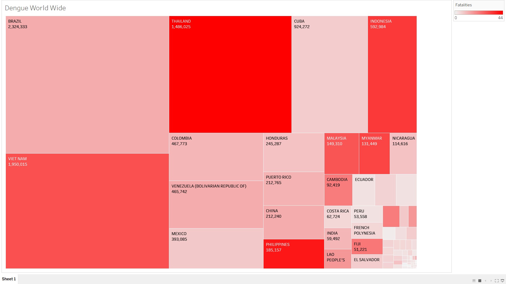
Each node is a country, colour represents the number of fatalities and area represents a total count value.
Data preparation: In Excel I have calculated removed all of the repeating country names, for each of them calculated fatalities and count value.
Question: So this on visualization each node contains mixed data for each year(1955-2009). What would be the best way to visualize that data for each year separately and show it on one image? Just have 59 different treemaps? I have all of the values calculated separately for each year in excel.
