Visualizing Measles in the US from 1899 - 1910 on a Bubble Map

Hello, I’m a third-year Computer Science student at Swansea University. I have been given the task of visualizing project tycho data. Below is a description of my visualization.

DOI: 10.25337/T7/ptycho.v2.0/US.14189004
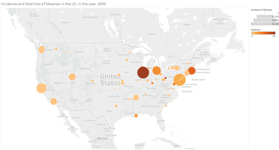
Visual Design Type: Bubble Map
Name of Tool: Tableau
Country: US
Disease: Measles
Year: 1899
Source: https://carto.com/blog/eighty-data-visualizations-examples-using-location-data-maps/

Visual Mappings:

  • Colour – Shows sum of fatalities. High intensity represents a high count of fatalities and low intensity represents a low count of fatalities.
  • Shape – Bubbles show the location of a city for which data was collected.
  • Size – Sum of incidence of measles.
  • Position – Bubbles positioned using latitude and longitude data for each city.

Description: This visualization shows the incidence of Measles over fatality rate in the cities within USA states, in the year 1899.

Unique Observation:
The incidence of Measles has been recorded throughout the US but mainly in the west, mid-west and north-east. From this visualization, we can see that the northeast has had the highest number of incidences of Measles. However, mid-west has had the highest fatality count. The Chicago city in the Illinois state has had the highest fatality count and the second highest incidence of Measles in the US. Based on this data I can assume that the outbreak of Measles started in Chicago, moved towards Detroit and then the northeast specifically Boston and Philadelphia.

Data Preparation:
have summed the incidence of Measles as well as fatalities for each city. This data has then been filtered by year to display only data that was recorded in 1899.

Question:
The visualization I have created only displays data for the year 1899. However, I wanted to visualize the incidence of Measles in the US between the years 1899 and 1910. I am looking for help to show the data between the years 1899 and 1910 on a single bubble map visualization.

Hello Oskar,

I like the idea of plotting the fatality rate using the colour scale on this map, it definitely gives a good overview of what was happening in 1899. If you want to show how this has changed over time, I suggest you look into how you could assemble this data in multiple graphs, then create an animation OR creating a matrix of the charts to visualise the data over time on a separate graphs. Alternatively, if you have to use a single chart you might want to make the bubbles more transparent and increase the number of shapes used (i.e. squares, stars etc.), but quite frankly, I don’t think you will be able to use a single bubble map for this purpose.

By adding data from different timespans onto this single graph you will quickly clutter the chart with a lot of data and make it even harder to come up with any observations.

Tableau has a pagining functionality which will allow you to create animation, simply drag the date field onto Pages field and select appropriate span using Filter field.

Best of luck with your assignment,
Marceli

1 Like

Hi, displaying data between the years 1899 and 1910 on a single bubble map visualisation is not a very good idea, because you won’t be able to see all the data which will make identifying patterns and location very difficult especially when bubbles start covering a whole state.
I would suggest dividing the data between the years 1899 and 1910 into quarters and then creating an animation with smooth transition between the quarters. Such method would allow us to spot trends in data as well as identify how measles has spread through the country.

1 Like