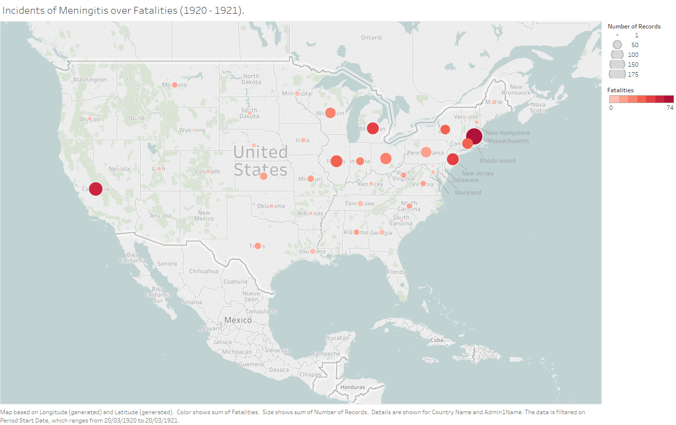
- Visual Design Type: Bubble Map
- Name of Tool: Tableau
- Country: United States of America
- Disease: Meningitis
- Year: 1920 – 1921
- DOI: 10.25337/T7/ptycho.v2.0/US.7180009
- Visual Mappings:
- Colour: Number of fatalities
- Size: Number of cases
- Position: Each bubble depicts a state in the map
- Unique Observation: When looking at this visualization, one can assume that the outbreak of this disease started from the East coast and spread towards the West over the period of time. The Midwest is not as infected as the East due to the fact that the virus and bacteria responsible for it spread when one person comes in touch with another one thus implying that the area is more crowded, something which is true for the East coast.
- Data Preparation: Summed the number of incidences and the number of fatalities.
My question:
Can I infer the aforementioned observation from the above visualization or do I need more data / more intuitive measurements.
References:
Van Panhuis, W., Cross, A., Burke, D., Counts of Meningitis reported in UNITED STATES OF AMERICA: 1905-1959 (version 2.0, April 1, 2018): Project Tycho data release, DOI: 10.25337/T7/ptycho.v2.0/US.7180009
Thanks!!
 ??
??