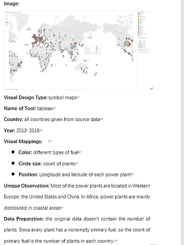
Hi, you can assume that I am a staff of a company that something to do with the power plant. and I’ve been working on finding a good place for some new plants. So I if I could do well, I might get promoted.
(ok, the truth is I am a student, my teacher “gave” me the job, lol )
the data source is:Global Power Plant Database - Datasets - WRI ODP
The question is:
I noticed that If the data and the data under the condition of the difference in the value of using the map as a visual analysis is not so easy to see that trend or details, for example, in my case, the capacity of different countries varies widely, lead to some local elements takes up the area is too big, but some places are too small, if I simply adjust the size, it is difficult to see the distribution trend of concrete. In this case, is there a better way? Like working with data. Or, can I use other visualization methods instead?
