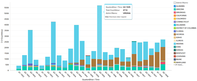
Hi, I am a student at Swansea University and are visualizing a data set from the Project Tycho(https://www.tycho.pitt.edu/). I have a question about this visualization:
I noticed that it is difficult to identify each state, especially for states with a small number of data. Digital map may could be a good solution. However, for digital map it is hard to find the trends that I mentioned in the unique observation. Therefore, my question is :
Is there a better way to express the data for each state and include potential trends in the data? or
Could you give some advises on this visualization?
You can find the image of my visualization and its introduction below.
Image:
Visual Design Type: Stacked Charts
Name of Tool: Zoho
Country: U.S.
Disease: Dysentery
Year: 1942 - 1948
DOI: 10.25337/T7/ptycho.v2.0/US.111939009
Visual Mapping:
- color: color is mapped to the states in the US
- x-axis: x-axis represents the years from 1942 to 1948
- y-axis: y-axis represents the recorded value of Dysentery
- hierarchy: Dysentery data in US are grouped by year → states
Unique Observation: We can clearly see there is an interesting trend that the distribution of Dysentery data before 1946 depends on the quarter. The values in Q3 are greater than other quarters. Until 1945, the number of data in Virginia was always greater than other states. Furthermore, the number of patients in Texas(the brown rectangles) has increased year by year since 1944.
Data preparation: In order to create the stacked chart, data of each year for each state of Dysentery data has to been used.
References:
Van Panhuis, W., Cross, A., Burke, D., Counts of Dysentery reported in UNITED STATES OF AMERICA: 1942-1948 (version 2.0, April 1, 2018): Project Tycho data release, DOI: 10.25337/T7/ptycho.v2.0/US.111939009
