
Here I have produced a hierarchical treemap using data obtained from the Project Tycho database: https://www.tycho.pitt.edu/data/#datasets
My question is whether or not people believe the re-use of count value for both colour and size mapping is redundant, and if so, why and, what other relevant information could be conveyed using either mapping without confusing the aim of the visualization? Any other constructive criticism is very welcome.
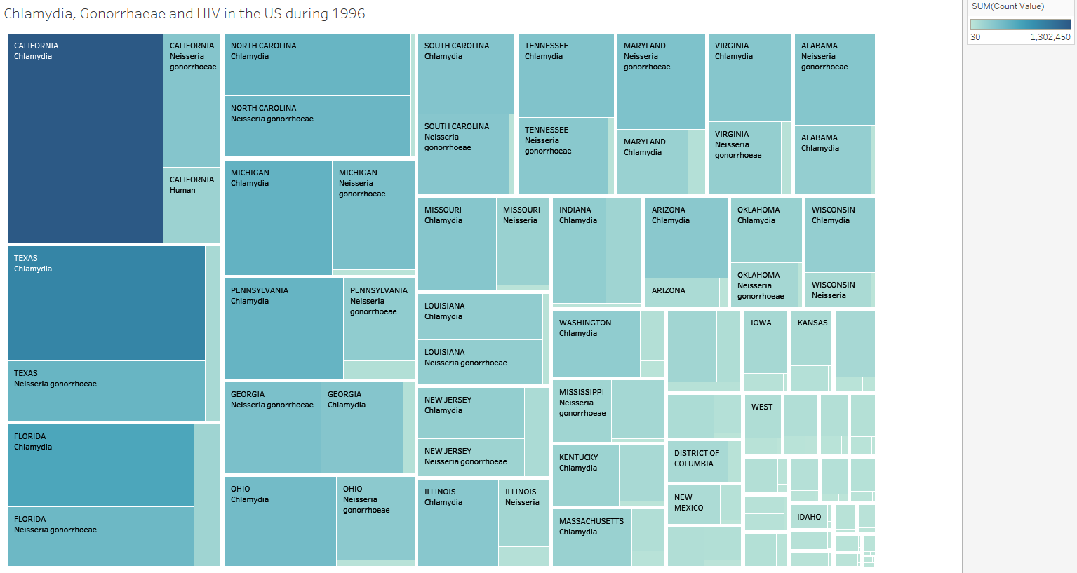
Some more information on my visualization:
Name of Tool: Tableau
Country: United States of America.
Disease: Chlamydia, Gonorrhoea, Acquired Immune Deficiency Syndrome (AIDS).
Year: 1996
Colour Mapping: Count Value (Pale blue - Low count, Dark blue - High count)
(Count Value I refers to the number of people with the disease in question in a particular time period. Due to the way in which the data is reported, it is possible that people will have been counted multiple times if they remain with the condition for an extended period.)
Size Mapping: Count Value
Position: Count value goes from maximum in the top left to minimum in the bottom right
Data Preparation: The 3 disease datasets were compiled into a single .csv file