
Hello,
I am a student at Swansea university who is studying computer science. For a data visualization module I have been asked to produce some visualizations based on the Global Power Plant Database. The visualization is shown below
Thank you for your time
Details:
-
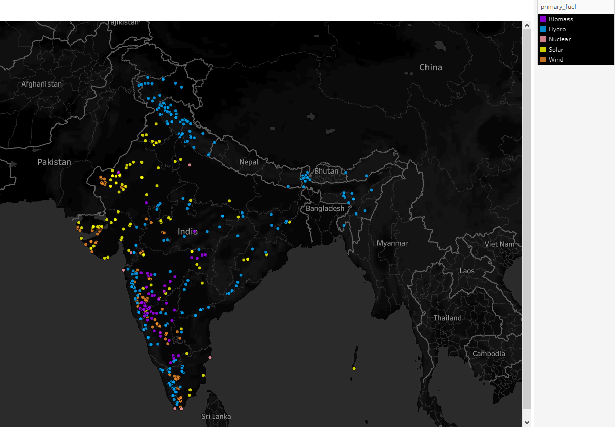
Visual Design Type : Map
-
Name of Tool : Tableau
-
Country: India
-
Year: All years in the database
-
Visual Mapping:
Color: Indicates primary fuel type per power plant
X-axis: Longitude
Y-axis: Latitude -
Observation: From this visualization we can see the most common type of renewable fuel source used by India to generate its electricity.
-
Data Preparation:
The database was loaded into tableau as a csv file.
I filtered out the the rest of countries in order to compile all of India powerplants data
I then filtered out all the non-renewable energy powerplants data -
Source: http://datasets.wri.org/dataset/globalpowerplantdatabase
-
Questions:
- Does the visual design make sense?:
- How can the visual design be improved?:
- Is my choice of color ideal?:
- Are there any other types of visualizations that would be better for this purpose?: