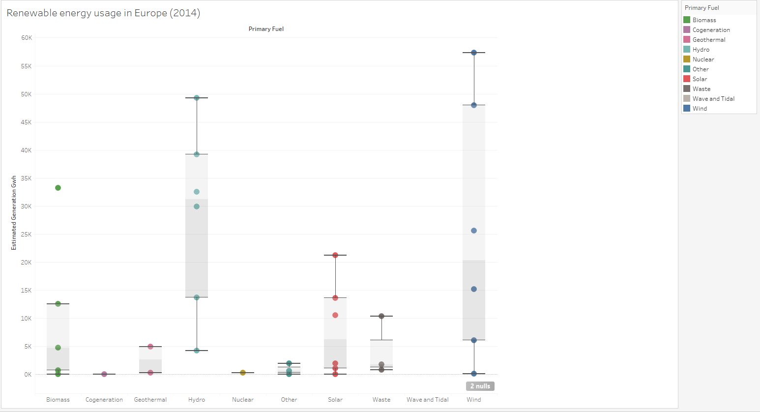
Visual design type: Box and whisker plot
Name of Tool: Tableau
Countries: Europe
Year: 2014
Visual Mapping:
Box: Each box represents the general sum of energy generation per fuel.
Dots: Each dot represent the sum of energy generation for a country, given a type of fuel.
Whisker: Each whisker represents the countries with the highest and lowest sum of energy
generation, given a fuel type.
Color: Color are mapped to each type of fuel. Color are chosen according to general impression to a
fuel type. For example, solar fuel is red, Hydro fuel is blue.
It’s a nice visualisation, what I would like to see is which country each dot represents(maybe as eur symbol. I also don’t see a need for “wave and tidal” unless you want to state that there is no such energy generation. Color looks distinctive enough for my eyes but I don’t see a need for a key if axis is already labelled or even separation using color as the points cannot conflict.
As far as information, I’m personally not sure what you are trying to show, i.e what question you are trying to answer.
It’s is a good idea to show which country each dot represent. Unfortunately, if I simply swap the dots with symbol, I am afraid it might end up being messy looking.
About the question I am trying to answer:
What is the major source of renewable energy in Europe?
I just found out I forgot to include such an important information…