
Guideline:
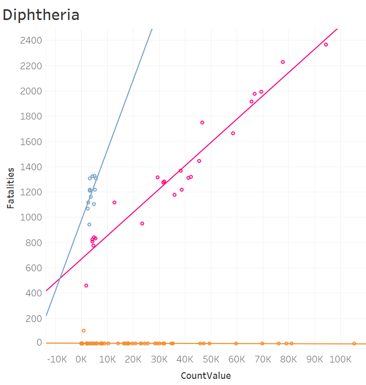
Visual Design Type: Scatter Plot
Name of Tool: Tableau
Country: USA
Disease: Diphtheria
Year: 1889~1981
Visual Mapping:
Colour: colour shows the different groups which this point is included.
X-Axe: the value of patients
Y-Axe: the value of fatalities
Shape: each point maps to a specific year.
Line: the linear regression of this group of data.
Unique Observation: this diagram mainly shown the mortality rates of diphtheria in different periods. It can be conjectured that in the early 20th century and the 1930s, there might be some significant medical breakthroughs in the field of diphtheria.
Data Preparation: separated data into three groups according to different periods, blue group earlier than 1905, pink group contain the 1910s and 1920s, others are involved in the yellow group.
Source: Include the URL / Book / DOI / Article
10.25337/T7/ptycho.v2.0/US.397428000
Question:
Does my visual design make sense?