http://datasets.wri.org/dataset/globalpowerplantdatabase
Hello, I am an international student studying at Swansea University and as part of one of my assignments I was asked to work on visualizing data that dealt with power plants and fuel types across the globe. Below I have provided a brief description of my visualization:
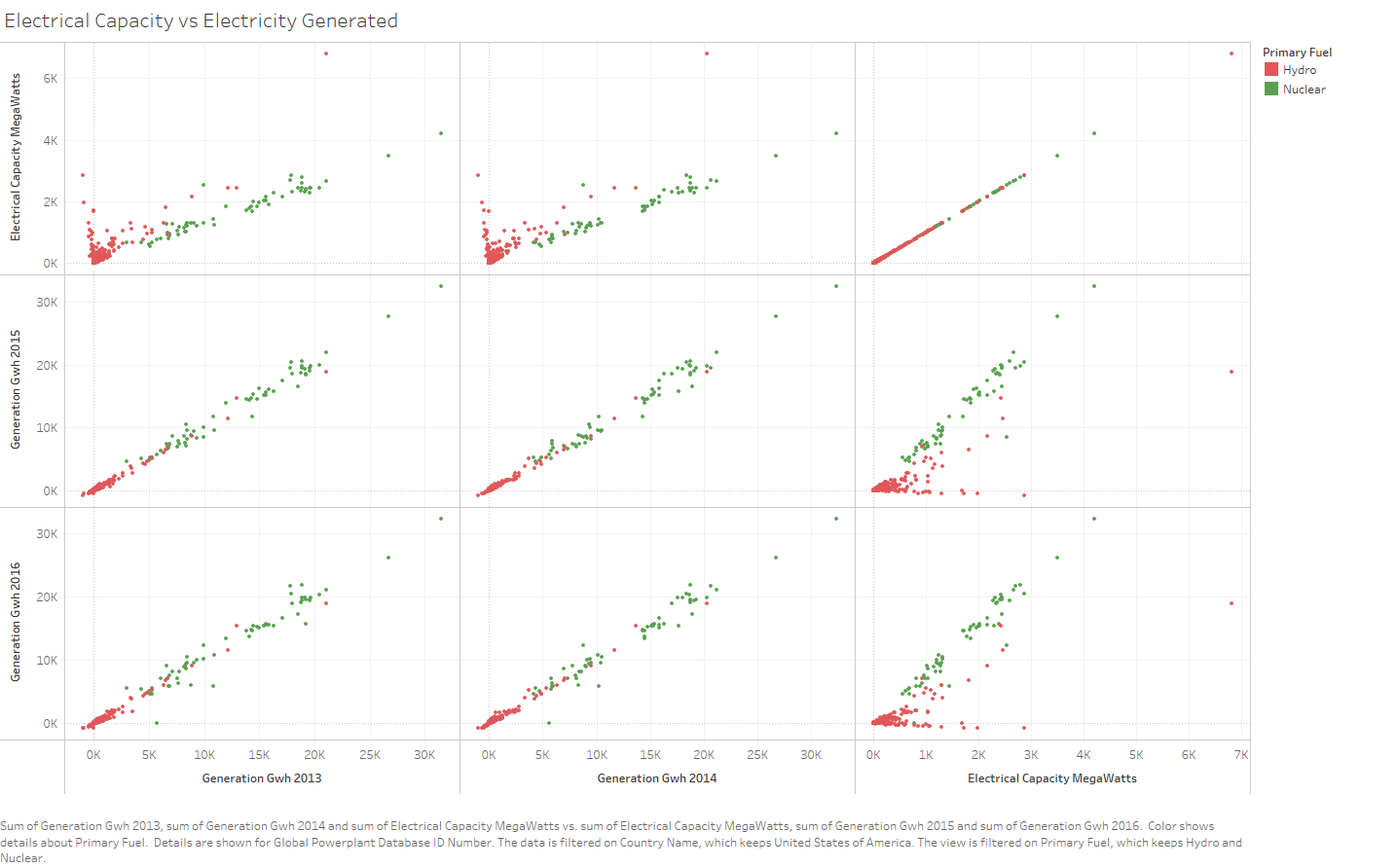
Visual Design Type: Coordinate Matrix
Name of Tool: Tableau
Country: United States of America
Year: 2013 – 2016
Visual Mappings: The columns are made up of the amount of energy generated in 2013 and 2014 as well as the total electrical capacity per powerplant. The rows are made up of the amount of energy generated in 2015 and 2016 as well as the total electrical capacity per powerplant. The country’s were filtered to only represent the powerplants in the United States. The primary fuels were color coordinated and filtered to only represent hydro and nuclear powerplants. The powerplant ID’s were used in the detail section to represent each individual powerplant.
Unique Observation: From this visualization we first see that energy generation tends to be very similar over the years with hardly any discrepancies between the two fuel types. However, the interesting fact resides in the outliers where we can see that the powerplant that has the highest electrical capacity at a little under 7k MW does not generate the most energy throughout the years.
Question: Does a coordinate matrix visualize this comparison the best and if not, what other methods would be better? Any and all insights are welcomed. Thank you!