Hi,
I am a Computer Science Masters student currently studying Data Visualisation. As part of my coursework I am exploring and visualising the Project Tycho data. I’m looking at the cases of TB across the USA from 1981 to 2014.
I have included a second image in the comments as new users may only post one picture

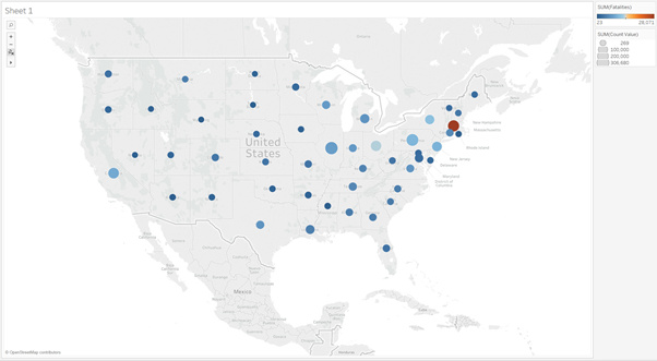
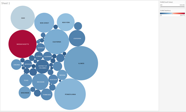
Visual Design Type: Choropleth and Bubble Chart
Name of Tool: Tableau
Country: United States of America
Disease(s): Tuberculosis
Year: 1891 to 2014
Visual Mappings:
- Colour: Shows the number of fatalities.
- Shape: Circles - size of which indicates number of cases.
References:
Unique Observation:
It can be seen on the Choropleth that the East Coast of the USA seems to have a slightly higher number of TB cases.
Data Preparation: Cumulative data had to be removed from the data set to prevent counting the same results twice.
DOI: 10.25337/T7/ptycho.v2.0/US.56717001
My Question: Is there a better way to visualise this data?
I feel that the choropleth type visualisation is sub-optimal, it could be better. I really like the bubble chart visualisation, however it lacks clarity in the states with smaller overall count for cases due to the fact that there isn’t space to label them. It also lacks the slight trend of Eastern states having a greater number of cases.
Any advice would be appreciated.
Many thanks,
Alex

