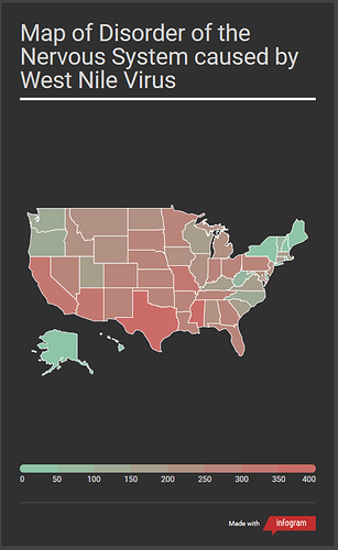
Hi, I’m a student at Swansea University trying to visualize data from Project Tycho (https://www.tycho.pitt.edu/dataset/US.430397002/). You can see my visualization below of a map showing the prevalence of the disease across the US.
Name of Tool: Infogram
Disease: Disorder of nervous system caused by West Nile virus
Year: 2002 - 2017
Visual Mappings
•Colors: The map uses red and green to indicate how many infections there have been for each state. The greener a state is the fewer infections there have been, the more red a state is means there have been more infections.
• State Name (Hidden unless you hover the mouse over)
• Amount of Infections (Hidden unless you hover the mouse over)
Data Preparation: Made a new CSV file from the dataset containing only the State Name and total amount of infections for each state.
My questions are:
How could I improve on this visualization?
Would it be better to have used different colours?

