Hi, I am a student at Swasnea University trying to visualise some data from project Tycho(United States of America (Mumps) - Project Tycho). Below you can see my visualisation of a stacked area chart comparing the number of mumps cases across each state in the US.
I carried out some research upon analysing the data set to understand certain trends and fluctuations in the visualisation above. Here is one of the useful links I used (https://www.pharmaceutical-technology.com/features/tracing-story-mumps-timeline/)
Image:
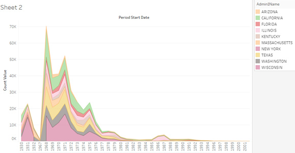
Visual Design Type: Stacked area chart
Name of Tool: Tableau
Country : United States
Disease : Mumps
Year : 1930 – 2017
Visual Mappings:
x-axis – Years from 1930 – 2017
y-axis – Number of cases
Colour – Each colour represents a different state
Area size – Size of each area represents h
ow many recorded cases of mumps there are in each state
Unique Observation : From the visualization we learn that cases in Mumps fluctuated between the years of 1968 and 1981, particularly between the years 1968 - 1972. This may be because the vaccine for mumps was introduced in the year 1967. We can also learn that the states Wisconsin, Texas and California have the highest recorded cases for mumps in that order.
Data Preparation: . No additional columns were added to the data file but the number of states were filtered after uploading the data to tableau to reduce the number of states included in the dataset.
DOI: 10.25337/T7/ptycho.v2.0/US.36989005
My question is how can I improve this visual design?
But also what other visual designs do you think would be better suited to visualise this dataset?