Visualising the number of fatalities caused by Dengue relative to the countries GDP

Name of tool: Tableau
Disease: Dengue
Time frame: 1955 - 2017

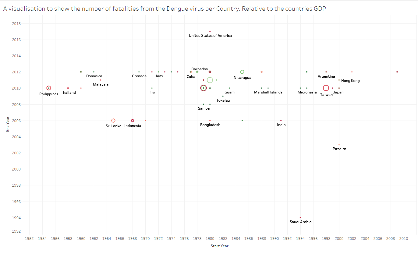
For my visualisation I have tried to map the number of fatalities from the Dengue Virus to each country. The size of each point is relative to the number of fatalities in the given country and the colour is mapped to the countries GDP. I used this wikipedia link to find out the GDP of each country:

X-Axis = Start Year
Y-Axis = End Year
Colour: GDP
Size: Number of fatalities

DOI for my visualisation: 10.25337/T7/ptycho.v2.0/AS.38362002

I would be greatly appreciative if you think there is a better method for visualising my current data set and i’d be grateful to know if my visual design makes sense.

Hi James,

You have a lot of variables to encode so this is understandably a difficult task. It is difficult to interpret your graph in several ways. Firstly, your size scale is too short so distinguishing difference in fatalities is challenging. You’ve used colour to show GDP but you do not provide a legend. I’m also having trouble understanding your axis, and how they relate to the GDP and fatalities.

Have you considered using a parallel coordinate plot? Each line could represent sequential years while you map GDP and fatality data in a similar fashion. I would think this might better show any trends.