
Hi everyone,
I have created this stream graph visualisation using the data provided by the Project Tychoo ( https://www.tycho.pitt.edu/ )
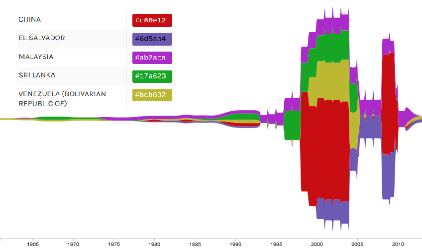
Name of Tool : RawGraphs
Countries : China, El Salvador, Malaysia, Sri Lanka, Venezuela
Disease : Dengue
Years : 1965 to 2010
Visual Mappings :
- X axis : year
- Y axis : number of infected people
- Color : each color represents a country
Unique Observation : the number of infected people rocketed in every country except Sri Lanka during the early 2000’s. China was the most affected country at that time.
Data Preparation : selected data about several diseases and put them together to allow comparisons
Source: https://www.tycho.pitt.edu/
DOI : 10.25337/T7/ptycho.v2.0/MY.38362002
Questions:
- What can I do to make it easier to identify a country from an other in the bit from 1965 to 1990 ?
- Are the colors I have chosen alright ? Maybe they are a bit pale but it seems to me that it is easy to identify a country from an other
- Are there any other types of visual layouts that you would recommend to visualise this set of data ?
Thank you very much 
 or simple line charts. Can you try and post your iteration?