Hello, I am a Master’s student currently studying a Data Visualisation module as part of my Computer Science Course. For our assignment we have been given the task of visualising Project Tycho’s data (https://www.tycho.pitt.edu/). I have a few questions about some of my visualisations and wondered if you could help?
Here is a description of my design:
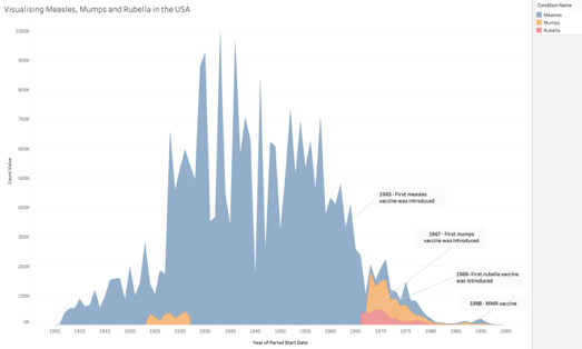
• Visual Design Type: Stacked Area Chart
• Name of Tool: Tableau
• Country: United States of America
• Disease: Measles, Mumps and Rubella
• Year: 1905 - 1995
• Visual Mappings:
o Colour: The colour is mapped to the three different diseases being investigated.
o Size: The size of each area corresponds to the number of cases that were reported, in essence the area represents the number of cases reported in that year.
• Unique Observation: From this visualisation we can see that measles is the most occurring out of the three diseases investigated, with mumps behind that and then rubella being the last. The introduction of the vaccines knowingly decreased the occurrences of all three of the diseases respectively. This observation is shown by looking at the three dates the individual vaccines were introduced and comparing the levels of the respective disease at that time. Around the time of each individual vaccine a slight increase in the disease is seen before a rapid decrease, which is in line with the trend of vaccinations. This also happens again around 1988, a slight increase can be seen before a decrease again, when the combined MMR vaccine was introduced.
• Data Preparation: To gain this visualisation, the data from Measles, Mumps and Rubella were collated together. The irrelevant rows and columns in each of these databases were removed.
Measles – DOI - 10.25337/T7/ptycho.v2.0/US.14189004
Mumps – DOI - 10.25337/T7/ptycho.v2.0/US.36989005
Rubella– DOI - 10.25337/T7/ptycho.v2.0/US.36653000
The question I have is whether there is a better visualisation type I can use to show the impact the vaccines have? Also whether there is a way I can incorporate the fatality rate into my visualisation?
Thank you in advance for any help!
Sian