Hi,
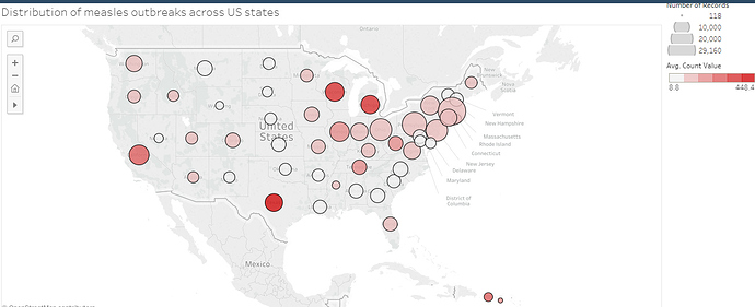
I am a Swansea University student currently trying to visualise some data from project Tycho (https://www.tycho.pitt.edu/). Below you can see one of my visualisations which is a plot showing the distribution of Measles across the US from 1888 to 2001.
Here are the main details of this visualisation:
Visual Design Type: Bubble map
Name of tool: Tableau
Dataset DOI: 10.25337/T7/ptycho.v2.0/US.14189004
For the visual mappings, each bubble represents a US state and the position is mapped to the geographic location of said state.
The size of each bubble is mapped to the number of measles recordings that have been carried out in each state, whereas the colour is mapped to the average number of measles cases found across all recordings.
In other words, bubble size can be seen as showing how prevalent measles recordings are in each state, whereas the colour can be seen as showing how quickly the disease tends to spread.
In terms of observations, the plot appears to suggest that there is a larger distribution of measles across the eastern half of the US compared to the west, with California being an outlier since it has a larger number of recordings and average cases than the other western states.
Also, Texas appears to be the state with the highest average cases per recording (indicated by the bright red colouring), despite being surrounded by states with a relatively low distribution of measles.
Data preparation was mostly handled using the Tableau public software itself, the number of recordings is the sum of all the records for each state and the number of cases is the average count value per recording.
There is a problem however:
I want to normalise the data by population to avoid any bias, I was hoping to use the technique described in Kelley Holden’s “Seeing States the Right Way: How to Weigh Data by Population” article for my colour mapping so that it was based on average cases per 100,000 people.
However, their plot only used data from 2014 which allowed them to get the projected state census for 2014, but my plot shows data from 1888 to 2001, so getting access to a census for every year would likely be impractical and time-consuming.
So my question is this:
Is there a more efficient way that I can normalise my data according to state population from 1888-2001?
Or should I consider some alternative method such as limiting the plot to just recent years or separating the plot by each decade?
Thanks,
LMT
Reference:
Seeing States the Right Way: How to Weigh Data by Population, Kelley Holden, 2016, Redirecting to https://digital.gov/301
