Hi, I am Swansea University Student and I am currently working on data visualisation coursework that involves visualising data from Ptycho. Below are my visual design and it’s details
DOI: 10.25337/T7/ptycho.v2.0/US.14189004
Tool: Tableau
Type of Visual Design: Choropleth Map
Country: United State
Year: 1888 - 1908
Visual Mapping:
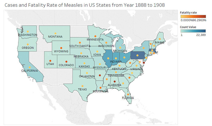
- Color: Blue color map to sum of count value of Measles in USA states, the deeper the color the greater the sum of count value. Yellow and Gold colors indicate the fatality rate of Measles in USA states. The deeper gold indicates the higher rate of fatalities otherwise lower.
- Shape: Circles on the map indicates the fatalities rate of a province.
- Map: States in United State.
- Label: Name of the state.
- Tooltip: show all information includes name of the state, num of the cases, num of fatalities, and fatalities rate.
Data Preparation: to calculate the fatalities rate, I have summed up the number of the fatalities and divided by the sum of the count value and times 100 (convert it into percentage). I have filter out non-sense data for such as state that named NA.
Description:
The image above shows the fatality rate over the number of infected people of Measles in the USA states from the years 1888 to 1908.
Unique Observation:
From the image above we can see that Pennsylvania has the highest sum of Measles Cases and Alabama has the highest fatalities rate.
Question:
During visualising the data, I have realised the fatal rate and the total infected patients are higher at the beginning of the years [between years 1888 to 1904] and it decreased after 1905. Hence, I am trying to create Small Multiple Choropleths so I can show more information in my visual design. I have seen the post [Visualising time on a geospatial map] and also trying to follow the video provided by SIM but it doesn’t work for the map. I have referred to one of the Tableau forum (i lost the forum link) and now I able to show the decades of years as row but not able to filter out the year that belong to the decade at the column What I have done so far. I am looking for help to show the only years that belongs to its decade.
Litreture: this blog https://bl.ocks.org/armollica/6314f45890bcaaa45c808b5d2b0c602f by Andrew Mollica inspired me to use of Small Multiple Choropleth Map.
Thanks in advance.
**Had remove one of the link coz it doesn’t allow me to post 2 link in one post

