Hi Data Visualizers,
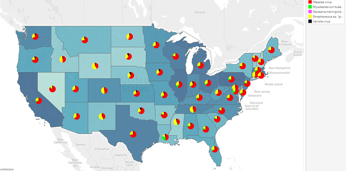
I’ve attempted to show the distribution of common diseases through the continental US. The goal is to identify trends in the data and deduce a causation from the correlation. I’ve selected measles, TB, meningitis, variola virus and streptococcus cases between 1900 - 2014. The data is pulled from (https://www.tycho.pitt.edu).
Visual Design Type: Choropleth Map, Piechart
Name of Tool: Tableau
Country: United States
Disease: Measles, TB, Meningitis, Variola virus, Streptococcus
Year: 1900-2014
DOI: 10.25337/T7/ptycho.v2.0/US.14189004
Visual Mappings:
Colour:
State colour intensity calculated as percentage case numbers of total.
Distinct disease cases shown as different colours on pie chart.
Position: Cases are bound to their geographical positions
Unique Observation:
We can see the majority of cases occur in the north east with Texas, California, Washington and Colorado also having a high number of cases. A correlation could be drawn in those states having large cities as compared to other mid-western states.
Distribution is fairly consistent with measles being the most diagnosed ailment.
Louisiana is an outlier with proportionately greater number of TB cases than other states.
Streptococcus seems to be more prominent in the mid-west.
Data Preparation:
Case numbers calculated as percentage of cases per state over all reported cases.
Mapping state/country to altitude/longitude.
So here’s some questions, any feedback welcomed.
Is my palette choice optimal to distinguish between diseases?
Have I selected too large a time-frame to extract any useful information?
Thanks for your time.
Chloropleth Map: https://datavizcatalogue.com/method/choropleth.html


