Source:
Due to a large number of datasets used, the DOIs and countries used for this visualisation can be found here
Context:
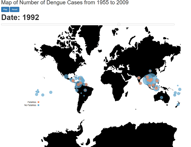
Hello, I am a student at Swansea University, currently completing an assignment for my data visualisation module. The assignment requires me to explore and visualise the Project Tycho data set to help find unique observations in the data. For this assignment, I have produced an animated bubble map to visualise the cumulative yearly count of Dengue for 99 countries from 1955 to 2009. As this visualisation is animated, the animation can be found here.
From the visualisation, we can clearly observe periods of high Dengue cases and also pin point countries with abnormally large outbreaks of Dengue such as Brazil and Cuba. A general consensus can also be made that fatal cases of Dengue usually occur in relatively small cases. We can also observe a significant decline in Dengue post 2004/2005.
.
Visual Design Type: Animated & Interactive bubble map
Name of Tool:
Data Driven Documents (D3) for visualisation
Colorbrewer 2.0 for colour scheme of datapoints (discrete data)
Country: all 99 countries available for precompiled Dengue datasets (Click source link for list of countries)
Disease: Dengue
Year: 1955 to 2009
Visual Mappings:
- Colour: Colour is mapped to the discrete classification of a countries case having fatalities or not
- Shape: Each case of dengue is represented as a bubble
- Size: The size of each bubble is mapped to the yearly count of dengue over a year period for a given country.
- position: The position of each bubble is mapped to the geographic location of the case the bubble represents.
Problem:
Whilst visualising the data i have tried to maintain integrity and honesty, To do so, i have employed the use of Tufte’s principles [1], more specifically:
-
Graphical Integrity - Visual representations of data must tell the truth. To do this, I have made sure to scale my bubbles appropriately by using the built in d3 Linear scale. As well as this, I have clearly labelled my data through the use of a legend and title.
-
Chart junk - the excessive and unnecessary use of graphical effects in graphs. I have made sure my visualisation has had any unnecessary frame elements removed (axis and grid lines) and dimensionality is kept to appropriate limits i.e. no unnecessary 3D. A well as this, animations are limited to transitions only to support the criticisms of B.Tversky as animations may take too much time for users to understand [2].
Question
From this problem, i have the following questions:
-
Have I been able to maintain a good level of integrity and honesty in my visualisation based on Tufte’s principles?
-
What improvements can be made to ensure integrity and honesty in my visualisation?
-
What other design principles/standards should i follow to produce good visualisations?
References
[1] Edward, T. (2001). The visual display of quantitative information. Graphics Press, Cheshire, USA.
[2] B. Tversky et al. Animation: can it facilitate?, In International Journal of Human-Computer Studies, Volume 57, Issue 4, 2002, Pages 247-262.

