I am a student from Swansea uni and for a coursework we are analysing and visualising data from Project Tycho (https://www.tycho.pitt.edu/)
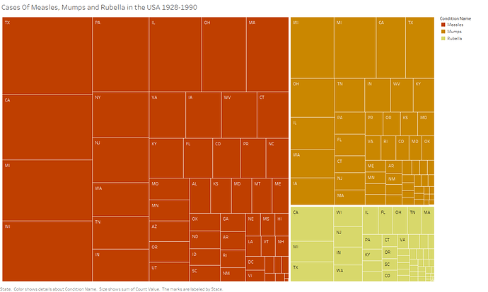
I have created a tree map that shows the hierarchy between measles, mumps and rubella within the states of America from the years 1928-1990. The hierarchy first divides the tree in to diseases, with the most numerous diseases appearing further towards the left and towards the top. Then the same occurs within each disease node but for the states of America.
Visual Design Type: Treemap
Name Of Tool: Tableau
Country: USA
Disease: Measles, mumps, rubella
Year: 1928-1990
Visual Mappings:
Colour: colour is mapped to disease
Text: I have used text to represent the states
Shape: each outer rectangle represents a disease, whilst the inner rectangles represent a state
Size: the size of the rectangles corresponds to the frequency of the illness, so the size of the outer rectangle for measles represents the total number of people with measles, and the size of the inner rectangles would represent the number of people in each state with measles
Position: the largest elements are on the left, with the largest element the top-left, and the smallest being the bottom-right. Also, the white space between elements is larger dependent upon their relative positions in the tree’s hierarchy
Hierarchy: they are grouped firstly by disease, then within each disease they are grouped by the frequency of the disease in each state
Unique Observation:
From the tree map, we can determine that measles is the most numerous disease, then mumps, and then rubella is last. We are also able to establish there is a correlation between population and the frequency of an illness.
Data Preparation:
To prepare the data set, I had to download 3 separate data sets for measles, mumps, and rubella, and then collate them in to one set.
DOI:
Measles: 10.25337/T7/ptycho.v2.0/US.14189004
Mumps: 10.25337/T7/ptycho.v2.0/US.36989005
Rubella: 10.25337/T7/ptycho.v2.0/US.36653000
Literature:
When helping to decide on what colours to use for my tree map, I looked at the paper “UX Color Theory: Applying Color Knowledge To Data Visualization” by Leigh Boone, Andrew Evans, and Chris Rogers. I then decided to go with decreasing intensities of orange. The decreasing intensity refers to the decreasing frequency of the disease, and orange refers to the seriousness of the topic. I did not choose to use red because my visualisation does not include fatalities, and red might suggest deaths.
Question:
Do you think the colour scheme I have chosen to use could be improved upon? Is it visually appealing, and is it immediately obvious what the colours represent?

