Hi,
I am a student at Swansea University who has been asked to visualize some data from the Project Tycho dataset (https://www.tycho.pitt.edu/).
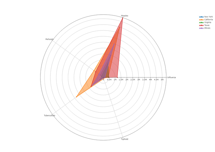
I have created a Radar Chart to visualize the difference in infection numbers of 5 different diseases in the US. Here is a link if you wish to take a closer look: https://plot.ly/~johnmctiernan/24/new-york-california-virginia-texas-illinois/#plot
• Image:
!• Visual Design Type: Radar Chart
• Name of Tool: Plotly
• Country: United States
• Disease: Measles, Influenza, Typhoid, Tuberculosis and Pertussis
• Year: 1888-2017
• Visual Mappings: Each colour represents a different state as shown in the legend. The diseases each have their own axis that visualises the count value of that disease for a given state. Each ring/circle represent 0.5 million people. We are also able to remove any of the states, if we wish to compare a smaller number.
• Unique Observation: We can see the Measles is the most infectious disease out of the five shown, as it consistently has the highest count value for each state. We can also see that even though the population of California is higher than Texas, the spread of measles in Texas over the past 100+ years has been much greater than that of California.
• Data Preparation: The sum of the count values had to be calculated using python syntax.
• DOI: 10.25337/T7/ptycho.v2.0/US.6142004
•Literature: T. Munzner, Visualization Analysis & Design, A. K. Peters, 2014. I used this literature when deciding if I should use this visualisation. Specifically, I looked at the use of length and area as a channel for visualisation. From this literature, I could see that position on a common scale, as well as area and length are good channels for the visualisation of ordered data.
My questions are:
- Is there any better way I could represent this data?
- Would it be a worthwhile time investment to add a time slider to shift through the years to compare yearly numbers?

