Hi all!
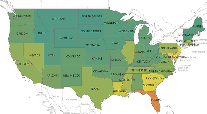
I think it is a good choice to display the desired data on a Choropleth US Area map, especially on a distortion free map, since it is often seen and therefore easily processed. With other words, you preattentively know what region you’re looking at. Also this type of map implies that the presented data is somehow related to the different US States. (1)
Regarding the explained data preprocessing (where the relative ratio of HIV cases to the total population of the state is used for visualization, instead of just the number of people diagnosed with HIV per State), I believe that this is an important point to bring up and consider, which in this visualization was well demonstrated! Otherwise if not used well, the real meaning of the data would have been percieved/communicated wrongly and the visualization would have been useless.
The choice of using colors to visualize the data is also in my opinion prefered to every other visual variable. Although I must agree with the previous comment that the choosen colors are not ideal. Personally I wouldn’t be able to correctly cathegorize lighter and darker tones of green used in the visualisation. This would also imply that I wouldn’t know which areas are “better” or “worse” in correspondence to the data, and how to compare them. I also need to argue that the choice of hue (green to orange/red) is a bad one, and that color blindness issues were not thoroughly considered here. As not an unsignificant part of the population is color blind, mostly unable to distinguish red and green tones. (3) Instead of a temperature coloring one color with different (distinguishable) luminance could have been used, since the visual system favors luminance (brightness) over color, and color over shape. (2)
Another point I’d like to mention is that I think it would be beneficial to use a legend in the visualization as then the viewer wouldn’t have to read additional text in order to know what is visualized, but could get all the information needed from the 2D graph.
Please also keep in mind that there are some important drawbacks of Choropleth maps, as for example that more interesting values are hard to discover since they occur in densely populated areas. Therefore, less interesting values are spread over big sparsely populated areas (wasting limited visualization space). And in correspondence to this, chloropleth map visualizations tend to highlight patterns in large but possibly low importance areas. (1)
I really hope that some points I brought up have been useful and please excusse the late response! 
Best wishes
Sources:
(1) Ward, M., Grinstein, G. G., & Keim, D. (2015). Interactive data visualization: Foundations, techniques, and applications (Second edition). CRC Press, Taylor & Francis Group. Section 6.4
(2) Ward, M., Grinstein, G. G., & Keim, D. (2015). Interactive data visualization: Foundations, techniques, and applications (Second edition). CRC Press, Taylor & Francis Group. Section 3.3.3
(3) Ware, C. (2013). Information visualization: Perception for design (Third edition). Morgan Kaufmann. Chapter 4 Color Blindness


