Guideline:
Hello everyone,
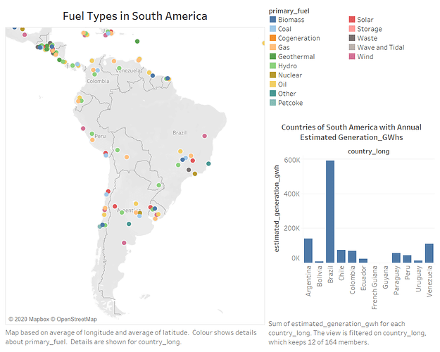
Based in a task in an assignment I would like to have your feedback regards to my visual design. The below design visualises the fuel types and the estimated generation (GWhs) in South America. I the Global Power Plant Database provided in the assignment.
Image:
Source: Global Power Plant Database - Datasets - WRI ODP
Visual Design Type: Symbol Map and a Bar Chart
Name of the Tool: Tableau
Countries Included: Colombia, Bolivia, Argentina, Chile, Peru, Uruguay, Brazil, Paraguay, Venezuela, Guyana, French Guiana, and Ecuador.
Year: 2019
Visual Mappings:
x-axis and y- axis as longitude and latitude in the map primary fuel as colours and circle shape in each country using the country_long. In the bar chart the columns represent the country and the rows represent the the sum of estimated generation.
Unique observation: As it show the in the map Brazil and Argentina have different types of primary fuel but Brazil is the highest when it comes to estimated generation GWhs.
Data preparation: The data set used in this visual design is not altered, and I filtered the countries of South America.
Reference: https://resourcewatch.org/
Question:
1 - Is the visual design clear?
2 - Is the Colour usage efficient?
3 - What alternative designs can be used?
Thank you in advance !
