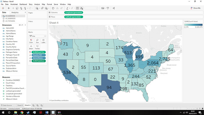
Guideline: Visual Design Type : Choropleth map
Name of Tool : tableau
Country : United States of America
Disease : Measles
Year : 1888 – 1908
Visual Mappings :
Colour : Blue colour map to sum of count value of Measles in USA states, the deeper the colour the greater the sum of count value. The label on each state represents the fatalities in that state.
Unique Observation : From the image above, we can see that Pennsylvania has the highest sum of Measles Cases.
Data Preparation : no modifications to the data.
Source: Include the URL / Book / DOI / Article
Question:
*Does My design make sense?
Would there be anything to improve on for the design?
Thanks.
