Created in Tableau Data Sources:
I’ve used project Tycho to gather data on diseases spread by Blood feeding arthropods (Dengue, Plasmodium, West Nile Virus)
DOI’s:
10.25337/T7/ptycho.v2.0/US.20927009
10.25337/T7/ptycho.v2.0/US.61462000
10.25337/T7/ptycho.v2.0/US.722862003
And Flooding occurrences :
From the flood Observatory Colorado
Description
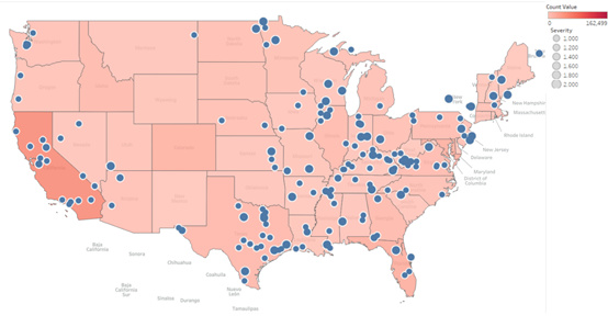
My main goal of the visualisation was to try and show that flooding causes a increase in diseases within the local area, as flooding provides an extremely suitable breeding ground for mosquitoes.
I mapped all occurrences of the diseases between a ten year time frame 2000-2010 , each sate is coloured. Darker shade of red being a larger amount of people with a disease.
I then overlay-ed a map containing all the location of flooding indicated by the blue circles. The larger the circles the higher the severity of flooding.
However as I’ve found there is no real correlation.
Questions
My Questions for the map are more so for formatting however any information on data to plot for a high correlation would be appreciated.
Should I change my colour scaling so that smaller differences are more visible? or is it important to show the similarity?
Should I remove the fill on the circles as some of the smaller states are harder to see ?
Is 10 years a large time frame and if so what is generally a suitable time frame? just under 223,000 records
Is there a better way of visualising the flooding?
My Questions for the map are more so for formatting however any information on data to plot for a high correlation would be appreciated.
If I understand your question correctly you are trying to show that there is a correlation, although I am not entirely sure that is the best approach. I believe our role is more to investigate the data and then observe phenomena rather than starting with a conclusion and trying to make the data fit our hypothesis.
Should I change my colour scaling so that smaller differences are more visible? or is it important to show the similarity?
I think ultimately this is your call, but what I would do is try to change the colours around and see what looks best to you
Should I remove the fill on the circles as some of the smaller states are harder to see ?
same goes for this, try and see whether it is worth losing maybe some perception of the size of the flooding for better clarity. Although if your design supports zooming I think that is enough for anyone who has a particular interest in a specific area
What I would suggest though is maybe trying to add colour mapping to the flooding circles (varying opacity might do) and also mess around with the min and max sizes of the circles