UK fuel generation for each fuel type vs the number of power plants per fuel type in the UK

Guideline:
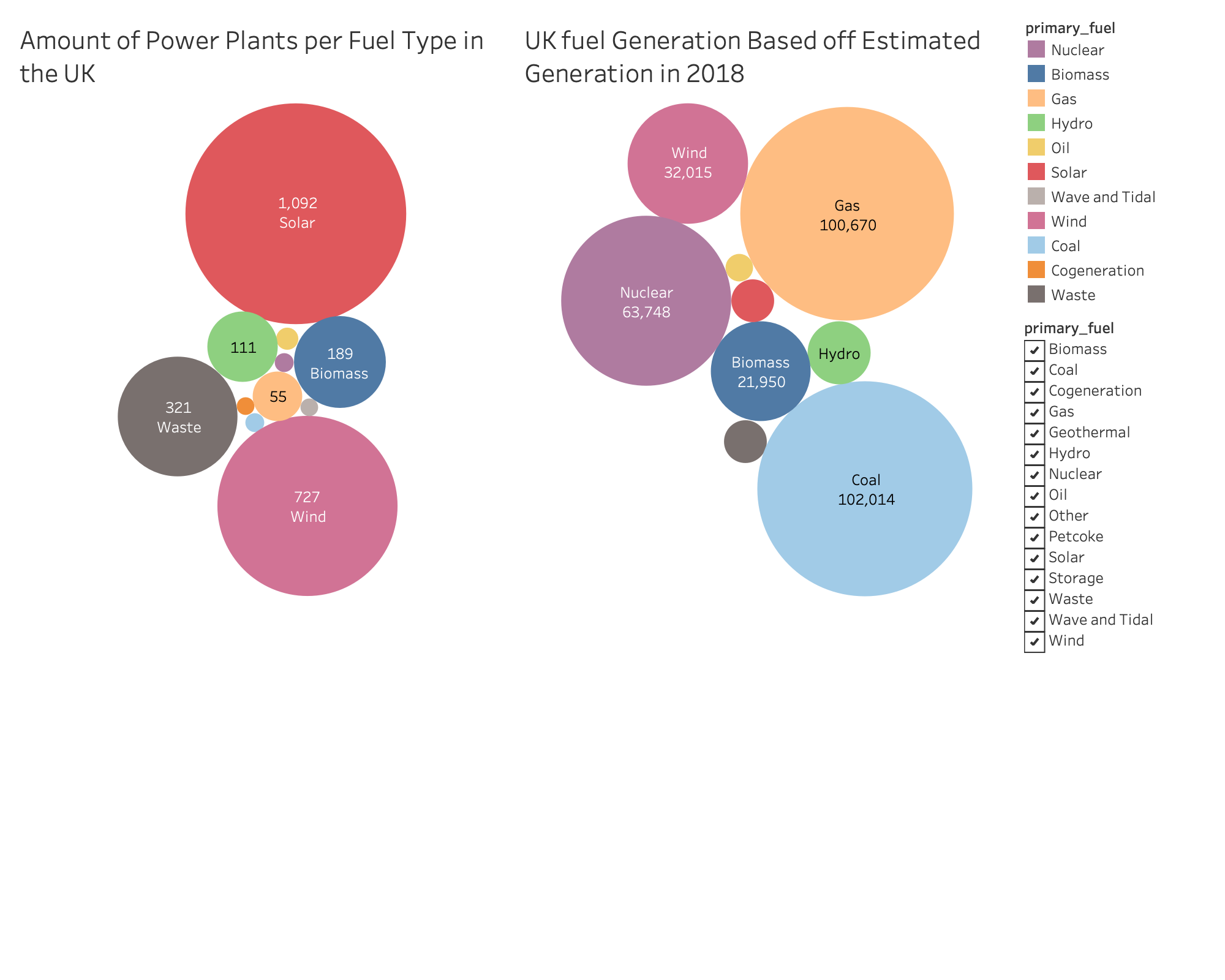
Hello. This visualisation aims to show the comparison between the number of power plants per fuel type and the amount of fuel generated per fuel type. the main comparison is Solar.

Name of Tool: Tableau
Country: United Kingdom
Year: 2018

Visual Mappings:
Visualisation 1:
Colour: primary_fuel
Size: CNT(primary_fuel)
Filter: Can filter by primary_fuel type
Label: primary_fuel, CNT(primary_fuel)

Visualisation 2:
Colour: primary_fuel
Size: SUM(estimated_generation_gwh)
Filter: Can filter by primary_fuel type
Label: country_long, SUM(estimated_generation_gwh)

Unique Observation: The UK has far more Solar power plants(1,092) compared to Gas(55) or Coal(8), yet produces far less energy, only 4,050GWH compared to Gas with 100,670GWH or Coal with 102,014GWH.

Data Preparation: The data has been filtered to only use data from the United Kingdom.

Source:

Questions:

  • Is my chosen visualisation method appropriate?
  • is the comparison between the number of solar plants and the energy generated from solar clear?
  • What can be improved?

+. The colours are distinctive which important for discrete data
+. The comparison between the sizes of the Solar bubble are clearly different and striking.

~. Bubbles are the correct use for this type of comparison data as they are easier to compare in size than other shapes. However, if comparing fuel amounts: boxes might illustrate the proportion between fuel amounts better.

-. Be careful using two bubble graphs when comparing different variables (amounts/numbers) that the scaling for both graphs are correct. Say if there were a massive bubble in the right graph; solar would become decreasingly smaller and be more disproportionate. But if you’re looking at proportion between each other as you may be, than this is accurate.
-. The sum of estimated generation might not answer your question. Can you compare this with the average production of each fuel source?
-. Your values need to have value in the illustration itself. How much fuel is 100,670? (Is it in mW/h, gW/h, etc…). A minor point: “The Number of Power Plants…”, not amount.

Overall, an interesting find and informative :slight_smile: