Hi everyone,
I have designed a visualisation with data from Global Power Plant Database and I would like to share it with you.
Image:
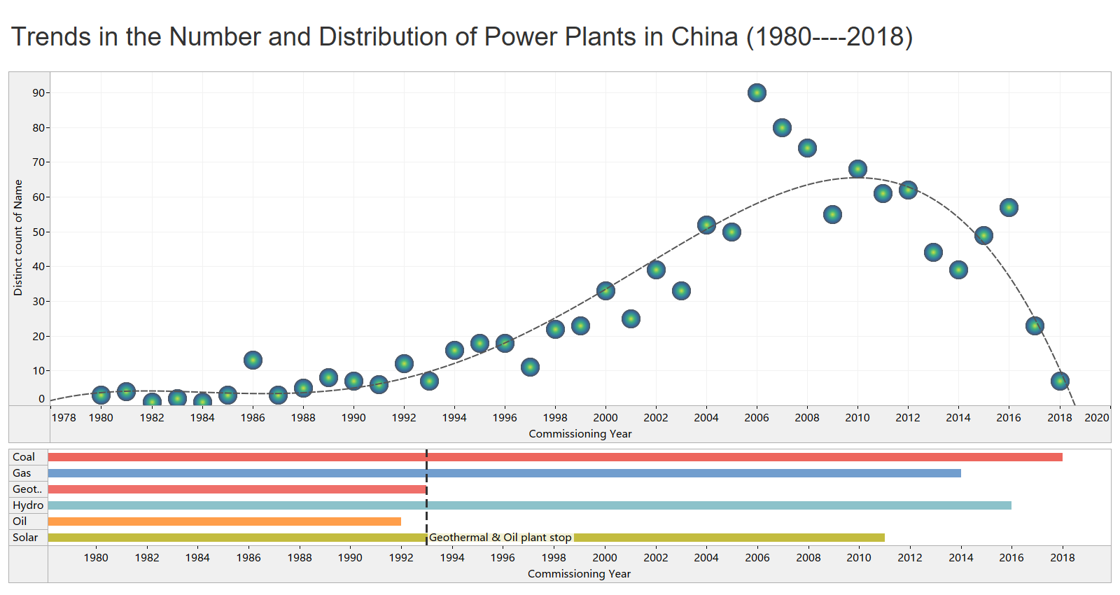
Discription:
Visual Design Type : density map + bar chart
Name of Tool : Tableau
Country : China
Year : 1980–2018
Visual Mappings :
Columns: Commissioning year from 1980 to 2018
Rows: The number of power plants, primary fuel
Color : Different types of fuel
Dotted Constant Line: By 1993, China stopped employing oil and geothermal energy.
Trendline: Trends in the number of power plants from 1980 to 2018 in China.
Height of balls: The number of power plants. The ball representing 2006 is the highest which means the number of power plants in China peaked in 2006.
Unique Observation : We can conclude that China had a growing number of power plants until 2006 when the increase peaked, after 2006, the number of power plants has fallen sharply. Moreover, by 2018, China has always been using coal energy.
Data Preparation : Data is only from the filtered country. Moreover, we choose the commissioning year only from 1980 to 2018.
Source: Global Power Plant Database - Datasets - WRI ODP
My Question:
• How can my visual design be improved?
• Are there any other types of visual layouts that would be better for this challenge?
I would appreciate it if you could give me some suggeations.
Thanks!