Hello, I’m a student from Swansea University looking for some general feedback for a Data Visualisation coursework.
Image:
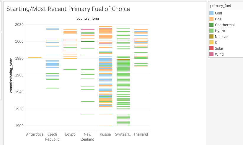
Description
Visual Design Type: : Gantt Chart
Name of Tool: : Tableau
Country: : Antarctica, Czech Republic, Egypt, New Zealand, Russia, Switzerland, Thailand.
Year: : 1900 - 2020
Visual Mappings: : : * color: color is mapped to the multiple primary fuels used. : * shape: shape represents each entity or energy company. : * position: the position of each rectangle shows the year in which the energy company was established. : * hierarchy: the energy companies are grouped by their countries.
Unique Observation: : We can see that Antarctica has not implemented any other new policy for energy consumption preferences as they only have a singular power plant (throughout the years 1900 – 2020) established and no new implementations have been made. On the other hand, the Czech Republic has initially gone from favouring Hydro back in 1944 to Coal in 2016.And similarly for Egypt, they have gone from Hydro (1967) to Gas (2014). New Zealand has gone from Hydro back in 1914 to showing an interest in Wind energy in their latest power plant. Not much change can be observed in Russia’s case as they have consistently stuck with Gas for their primary fuel. The same can be said for Switzerland as they have stuck with Hydro throughout the years. Thailand also continues to favour the same energy type with Gas as their main choice.
Data Preparation: : Null values were properly dealt with and the appropriate filtering for the countries were done to give the required results.
Dataset: Global Power Plant Database - Datasets - WRI ODP
Question:
I was wondering if my graph is any good in representing varying trends for the most preferred fuel choice for the seven countries (are the colors and the other features in my graph appropriate)? Also, I would like to know if there are any better options/forms of representation?