TreeMap Visualisation on Electrical Generating Capacity of Power Plants globally

Hello All!
I am working on an Assignment for my Data Visualisation class at University, and have created a Tree Map example based on Power Plant data globally. I am new at creating fascinating and effective visualisations and would like help and feedback to perfect some of my initial work.

Thank you all so much for your time and suggestions!

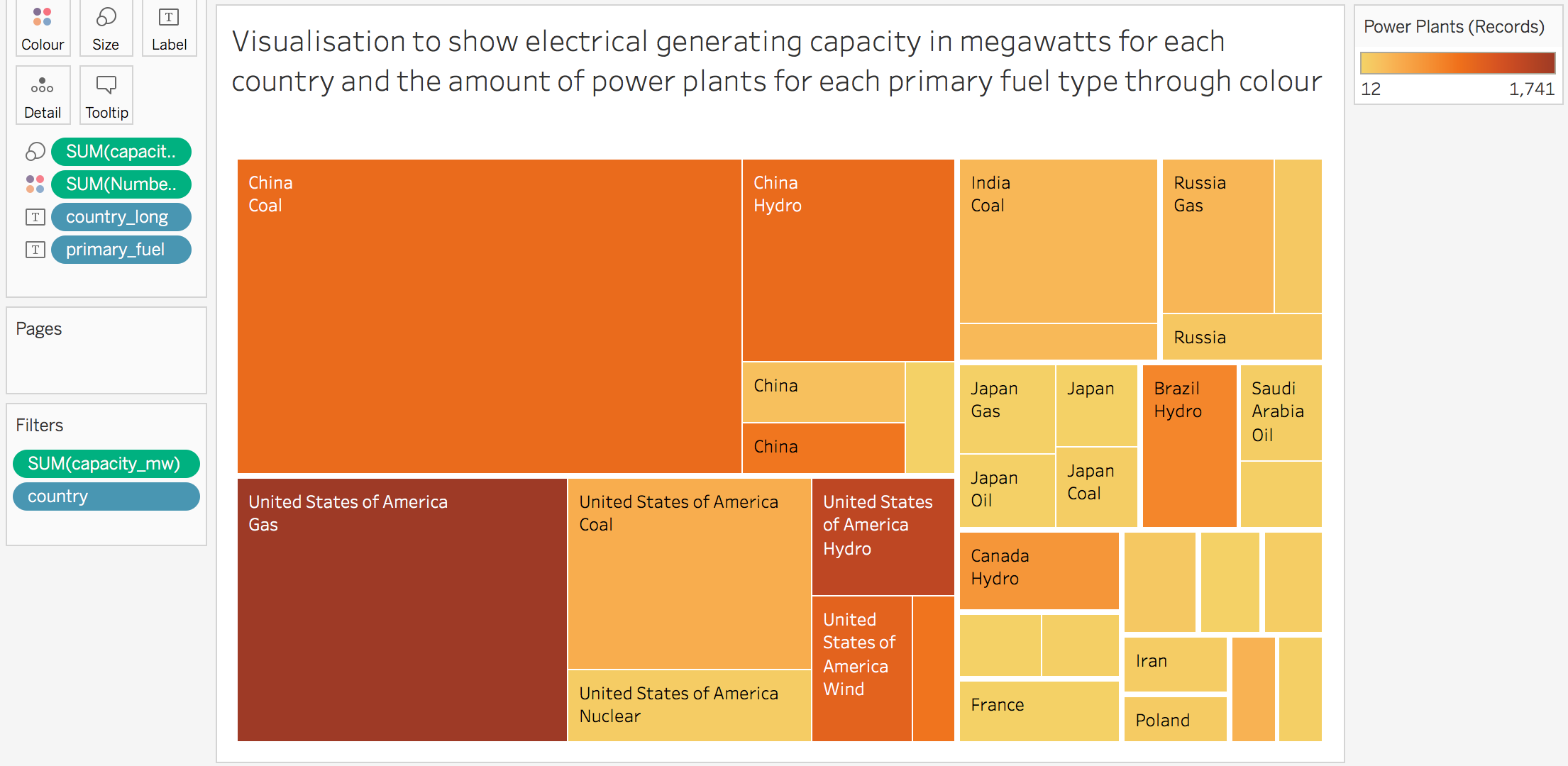
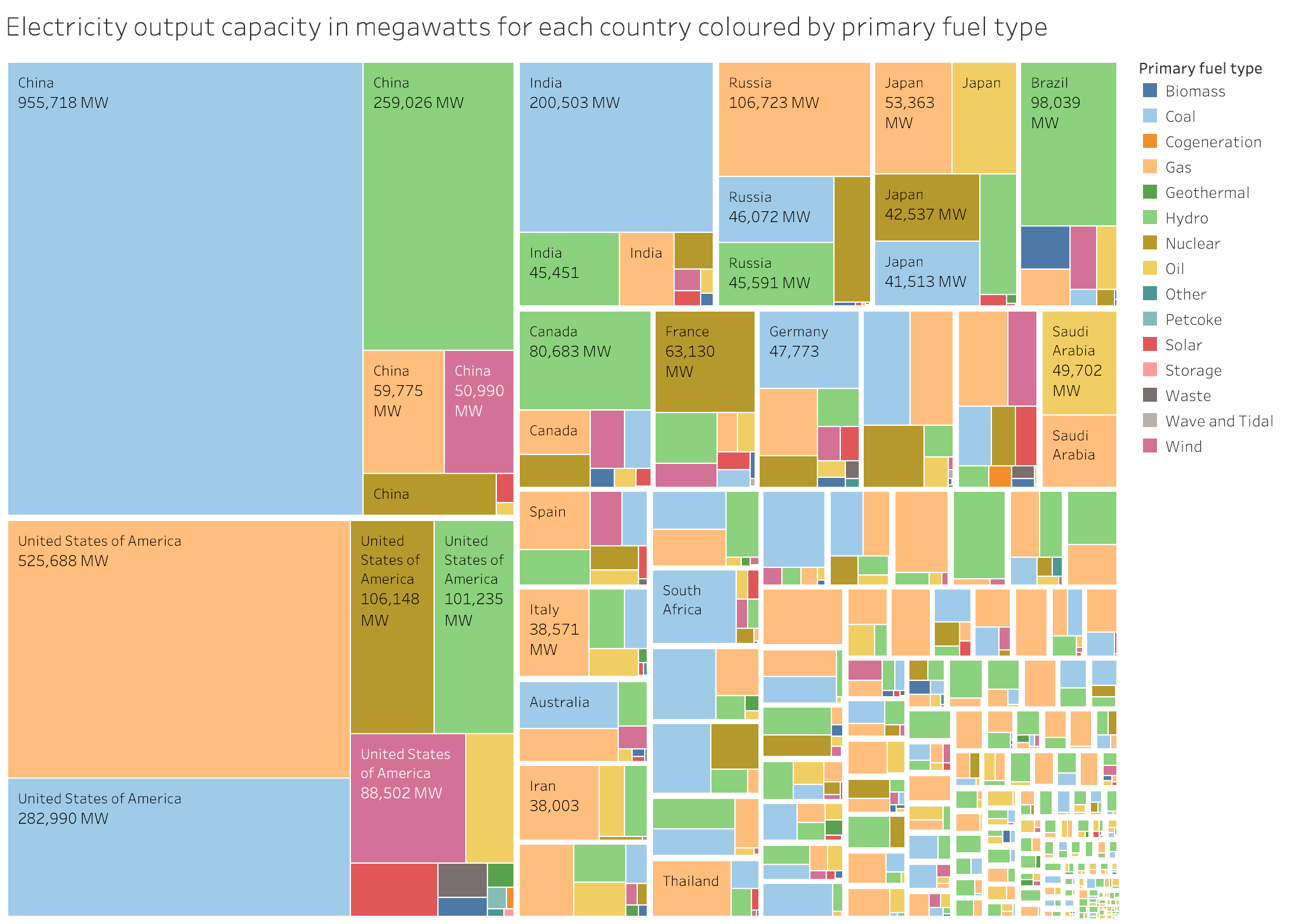
Visual Design Type : Tree Map

Name of Tool : Tableau

Country : USA, China, UK, France, Canada, Brazil, Germany, Spain, India, Russia, Japan, Saudi Arabia, South Korea, Iran, Poland, Norway, Australia, Italy

Year : All available dates

Visual Mappings :

  • Colour : Total number of power plants recorded in that country
  • Mark : Square/Rectangle sorted by Country
  • Size : Capacity(mw). Electrical Generating Capacity measured in Megawatts

Data Preparation:

Filters out countries with low electrical generating capacity, regardless of the country’s number of power plants. Added in steps to the colours to allow for easier comparison.

Source : http://datasets.wri.org/dataset/globalpowerplantdatabase

Unique Observations : China has a larger electrical generating capacity (EGC) despite having far fewer power plants. The United States however has the most power plants of any country. The visualisation clearly shows each country’s leading fuel type, with China being predominantly Coal, whereas the US is Gas. Despite having very few power plants, Japan has a very high electrical generating capacity. Does Japan’s high EGC speak to efficiency in plants over numbers? Newer power plants that are designed more efficiently?

Questions : Does the Visualisation deliver the information clearly?
Is the colour scheme correct?
Is there any way I can improve this visualisation?
Does the size of each section showcase information clearly?
Is there too much information in this visualisation?

Thank you very much for you help!

Overall I think this visualisation really interesting and provides cool insights.

To answer questions:

  1. Generally the visualisation is very clear, and I am able to extract useful insights from it. However, I found it difficult to distigiush which rectangle belongs to which country, so I would suggest using a different colour for each country (not sure if this is possible tableau).

  2. The use of opacity for number of plants is intuitive, however, as suggested above you could use different colours for the countries.

  3. You could added the capacity value and number of plants value on the rectangles to be extra clear.

  4. The size does a good job in highlighting the number of plants and it’s easy to compare with the other nodes.

  5. The visualisation has a good enough of information to extract insights, but as suggested above you could add the capacity value on the rectangles as well.

Nice job!

Hello,

I’m OP’s coursemate at the same university, this is my own visualisation of the same dataset.

Changes I made from OP’s version:

  • Rectangles are coloured by the fuel type they are representing, rather than the number of power plants using that fuel. In OP’s visualisation it is not possible to see what type of fuel a square is representing if it is too small to be labeled, this change allows the reader to obtain that information by comparing the square’s colour to the legend.
  • Continuing my previous point, the number of power plants for a fuel type in a country is omitted from my visualisation, as I do not believe it is a useful metric in the context of comparing energy output capacity of different fuel types by country. I’d love to be corrected if I’m wrong though.
  • All columns from the dataset are included in the visualisation, instead of only the major countries hand picked by OP. This change highlights the enormous power throughput of USA and China compared to the rest of the world, which cannot be interpreted from OP’s visualisation.

Which visualisation is more perferrable? Any constructive criticism would be appericated.

@965663 Instead of taking a screenshot, you can export a PNG of your Tableau visualisation by navigating to Worksheet > Export > Image… on the menu bar.