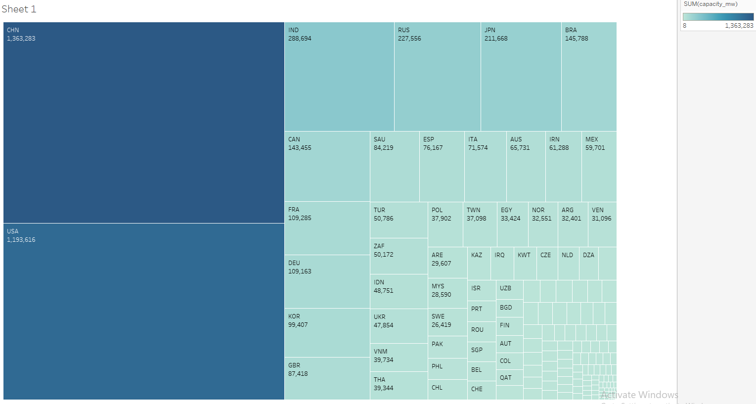
Colour: maps to the sum of electricity capacity of the country.
Size: maps to the sum of electricity capacity of the country.
Unique Observation: China and USA lead by a substantial margin, quadrupling the 3 place’s (India) value. The differences from 3rd place and below are not too drastic which just shows how far ahead USA is in terms of development compared to the rest of the world.
Data Preparation: The gradient isn’t as effective because of the very large difference in values caused by USA. Therefore, I added numerical values to show the exact values of the capacity of each countries to help users truly see the difference.
I really like the structure of the treemap - it is clear and easy to see how the countries are ordered. What would be nice to see is maybe some comparison to the size of the country ie. the USA or Russia is significantly larger than Japan. That would provide some insight into the country “efficiency”.
Hi DipLim,
This is a good visualization. Solid observation and justification as to the limitation of the colour gradient. A potential improvement could be to look into using stepped colours as opposed to using a colour gradient.
Having a low amount of step values will make any large changes more noticeably visually.
As an example, Canada has almost double the value of Italy on the chart, but it’s very difficult to see that due to the lob-sided nature of the colour gradient
Despite those grips, your visualization conveys it’s overall meaning clearly enough!