
Hi everyone! With this visualization, I intended to show how many plants use a renewable primary fuel type rather than a non-renewable one. I have attached the treemap itself below, and my questions follow.
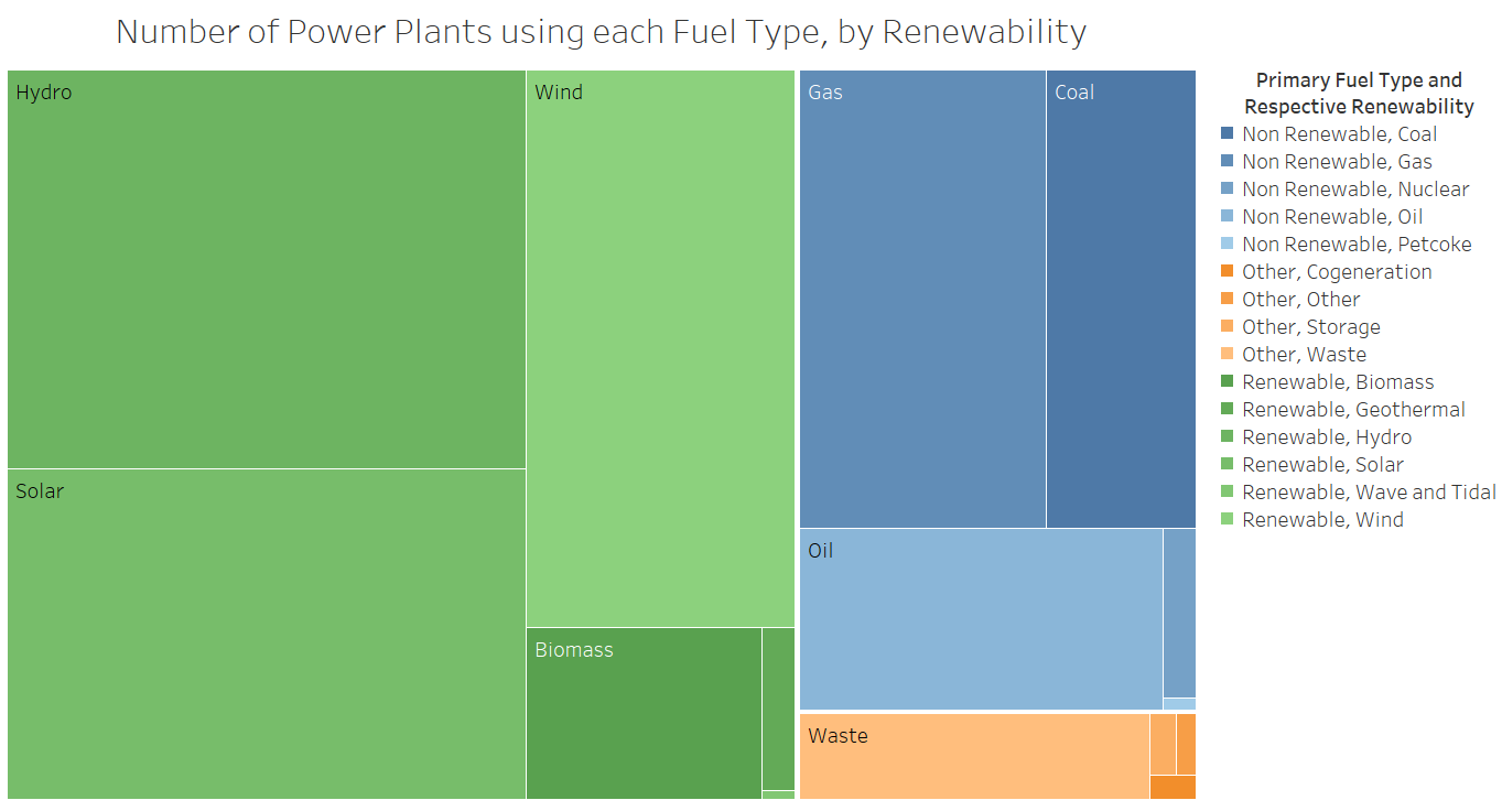
Visual Design Type: Treemap
Name of Tool: Tableau
Country: All Countries
Year: 2019 (The release date of the data set)
Visual Mappings: Colour is mapped to renewability and specific primary fuel type, size is mapped to the number of power plants, and text labels are also mapped to specific primary fuel type.
Unique Observations: There are more renewable power plants than non renewable ones. The most commonly used primary fuel type is Hydro, and there are more Hydro plants than Gas and Coal plants combined. The most commonly used non renewable primary fuel type is Gas.
Data Preparation: Adding a “Renewability” column to the data set based directly on
Source: Global Power Plant Database: http://datasets.wri.org/dataset/globalpowerplantdatabase
Questions:
- Could my choice of colours be improved?
- Could I improve the formatting of the legend such that it still shows all the specific information that the treemap itself does not?
- Are there any other ways I could improve this visualization of the data?
Any and all feedback is appreciated. Thank you!