Tree Map of Primary Fuel Capacity

Hello, the VisGuides community.

I am, as part of an assignment, trying to visualise data to try and gain potential insights from it. The dataset that I am using is: http://datasets.wri.org/dataset/globalpowerplantdatabase .

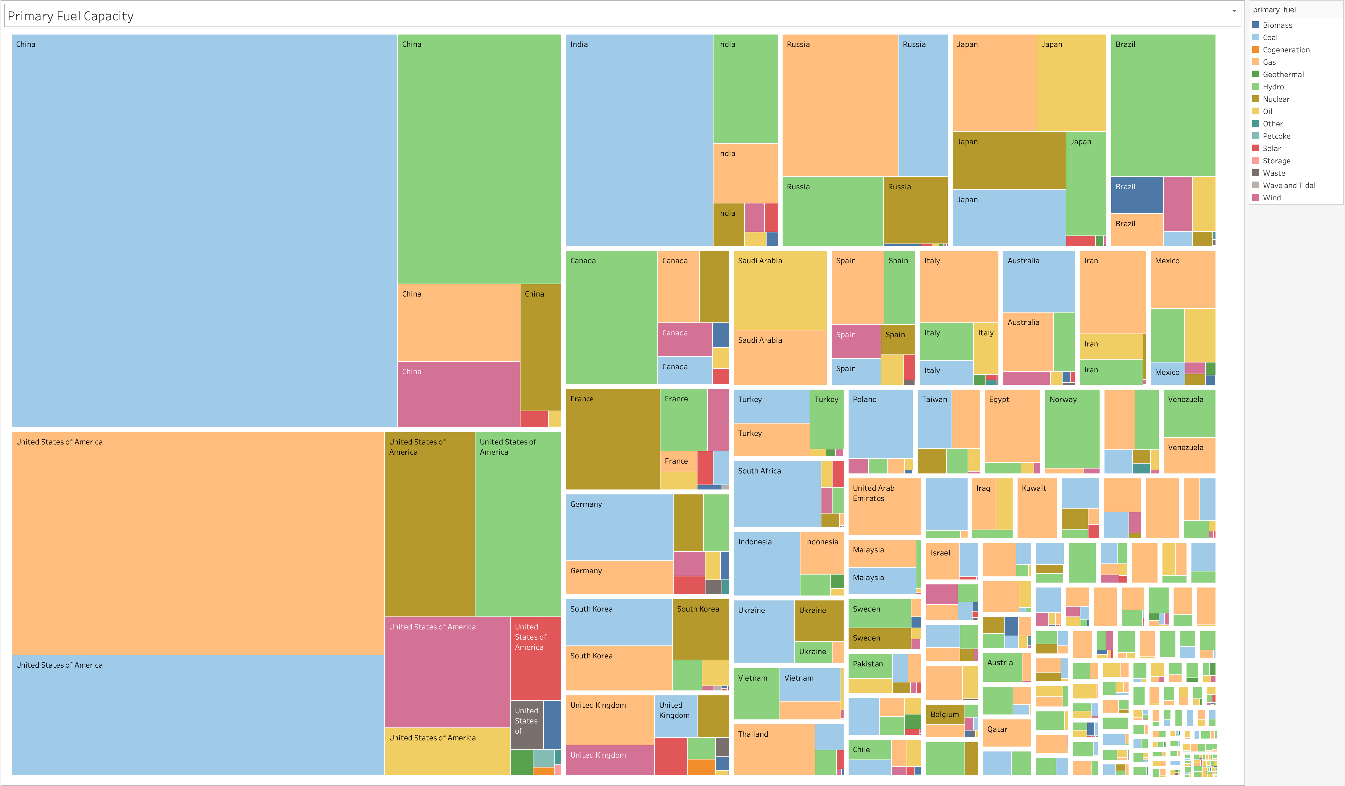
I have created a treemap, using Tabular, that tries to show the total capacity of all the countries, within the datasets, different power plants by their primary fuel. The dataset has not modified in any way for this visualisation. The fields used are capacity_mw to find the sum; country_long to provide the text overview; primary_fuel to provide the colour coding. However, there are a few things that I would like to get some advice on please.

  1. Is this graph clear in what it is representing?
    1b) Does it show a clear hierarchy within the treemap visualisation?

  2. Are there any changes you would suggest to make this a more effective visualisation? i.e. changing colour schemes, or using a different visualisation method to display the data.

Thank you for any help or advice.

Hello, good start for an effective visualisation!

To answer your first question, the colour for each of the fuel types can be linked to the tooltip provided within the display so it should be intuitive for most users to understand the relation in the treemap between fuel type and colour.

It is also easy to understand that each country is ranked on their total capacity compared to all others, which is then broken down on a per country basis as to how their power is being generated. A problem with this visualisation however is that due to the sheer number of countries you are trying to display, the majority of them cannot be recognised and if you were to look at this visualisation without access to the source data where you can interactively view the labels, a lot of the information you are trying to convey will be lost. I believe a better approach would be to categorise all of the countries in separate continents. This will serve for two things, 1) you can highlight your ability to manipulate the data given to you by creating novel groupings in the data and 2) it will vastly simplify the presentation of the treemap and you will gain, not lose insight into the data that you are trying to convey since each continent should be able to be read without needing the source data.

A last note, maybe look at colorbrewer for effective colour choice, although what you have picked seem distinct enough!

Hope this helps, good luck with the rest of the assignment, a fellow Swansea Data Vis. student!

Hello,
First of all, I want to say that I agree with the ideas of DataBrock : If you categorise all of the countries in separate countries and create your hierarchy based on (continents - countries), it could be more effective. Furthermore, you might try to change your colour scheme and match each primary fuel type to more intuitive color. For example, hydro can be matched to blue or solar can be matched to yellow.
Thanks so much