Guideline: Tree Map from Tabular. Showing capacity of different fuel types with percentage, country’s name and real number of capacity(mw) in the blocks of tree map.
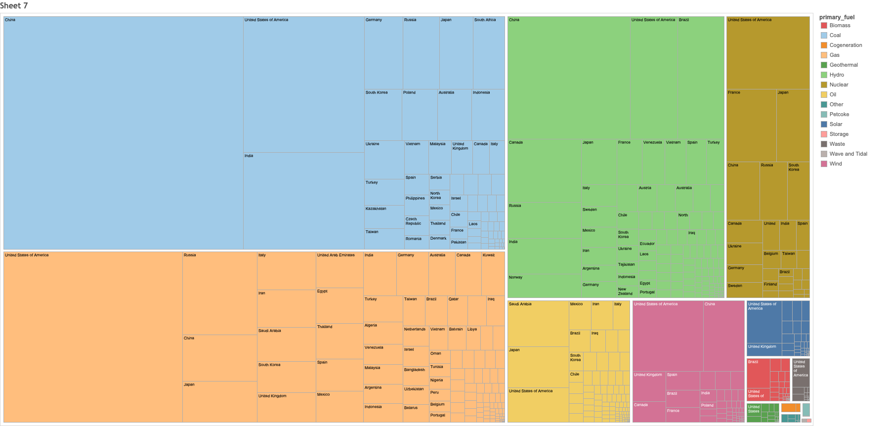
Source: Global Power Plant Database - Datasets - WRI ODP
Question:
Any suggestion or changes you would like to make to improve this visualisation?
Feel free to give any advice, thank you for spending time to look at this.