Hi,
I have created a Treemap representing the amount of power plants across the globle, and the amount of capacity for each fuel type. I am new to creating treemaps so if there is anyone can give me some advice on this visualisation that would be great.
Thanks!
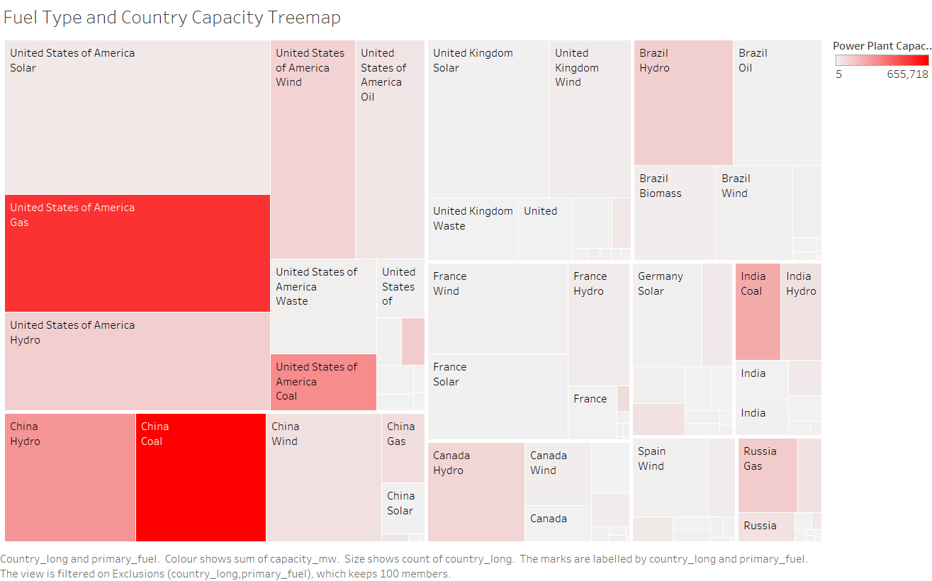
Image :
Source : http://datasets.wri.org/dataset/globalpowerplantdatabase
Visual Design Type : Tree Map
Name of Tool : Tableau
Country : USA, China, UK, France, Canada, Brazil, Germany, Spain, India, Russia
Year : All available dates
Visual Mappings :
- Colour : Capacity(mw). Based on the amount of capacity.
- Mark : Square/ Rectangle
- Size : Total number of power plant with specific fuel type,
Data Preparation:
Filters out countries with low amount of power plants.
Calculate the sum of the capacity of the power plants.
Unique Observations :
- United States of America has the most amount of power plant in the world.
- Coal power plants in China has the most electricity capacity in the world.
- In the United States of America, the most electricity capacity fuel type is Gas.
- Although China has almost the same amount of Coal and Hydro power plants, Coal power plants has a much higher capacity comparing to Hydro power plants
Questions :
- I have tested out a few different colour and Red gives the best visual result in my opinion, however I think this is not the most optimal colour. Is there a recommanded colour of choice?
- Should I use the generated electricity instead of capacity for this treemap?
- Is this visualisation clear or is there any advice that I should further improve my treemap for a better visualisation?