Total Energy Productions based on fuel type

Guideline: Hey, as part of my coursework am using the powerplant data set below to make various deductions. This is one of the visualizations I made. I just wanted to ask for any constructive critisisms and feedback you can give me so I can improve my designs.

Image:

Source: http://datasets.wri.org/dataset/globalpowerplantdatabase

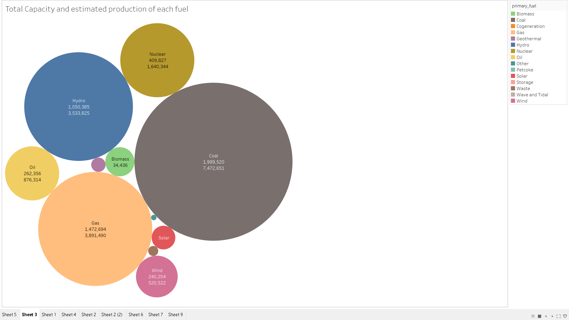
Visual Design Type: Packed Bubbles

Name of Tool: Tableau

Country: Whole world

Year: 2019

Visual Mappings:
Size: Sum(estimated_generation_gwh)
Label: primary_fuel
Label: Sum(capacity_mw)
Label: primary_fuel
Label: Sum(estimated_generation_gwh)
Colour: primary_fuel

Unique Observation: Most of the world’s energy production is based on non-renewable coal. However, the renewable fuel hydro is used to produce almost as much as the non-renewable gas. Which suggests it is either efficient or easy to find an area to build a suitable powerplant.

Data Preparation: None

Question:

1)Do you believe the graph is clear? As in does it show the different fuels and their productions clearly?

2) Would another visualization type be more suitable?

Thank you for your time.

Hi,

I’ll try and answer your questions to the best of my ability.

  1. The visualisation is clear in terms of showing which fuel belongs to which bubble by looking at the legend. Showing the names of the fuels inside the bubbles further aids this. The colours are distinct enough to tell each fuel apart on the visualisation, even the ones that are not labelled. However, there are 2 numerical attributes shown on the bubbles. I couldn’t tell which one represents the total capacity and which one represents the estimated electricity generation, so perhaps you can put a label before the numerical attribute like ‘Estimated Production: 1000’.
    Also, I couldn’t tell what the sizes of the bubbles are based on without looking at the description template. So it’s best to show one numerical attribute, if you are going to show them, that represents the size of the bubble (the estimated electricity generation in this case).
    If you want to show any additional attributes, then it’s best to show them on a tooltip rather than the actual visualisation itself.

  2. A tree map or a bar chart would be better to show the scale between the fuels (their estimated generation). For example, if one fuel had an estimated generation of 950 and another had 1000, then it would be hard to tell their sizes apart when being shown as a bubble, without showing their exact values.
    For the results you’ve got, this isn’t much of an issue as you can tell that one fuel has more or less estimated electricity generation than the other.

Generally, I think you should focus on either total capacity or estimated production for this kind of visualisation and display any other details you want to show on a tooltip. Just edit the misleading details to avoid confusion, otherwise the visualisation is pretty good.

Hope you found this useful!

Hello there,

Generally a good attempt.

1. The visualization clearly distinguishes the fuel types but only gives a general idea of how much the generation and capacity for each is compared to the other fuel types displayed. If that was the objective of your visualization then that’s great, otherwise maybe another visualization type would be more suitable, which leads us to your next question.

2. Packed Bubbles aren’t very suitable in terms of displaying accurate numerical data to the viewer, but mostly for comparison. If you wish to give a more detailed overview of the numbers regarding generation and capacity, you could potentially use other visualization types, such as side-by-side bar or even box-and-whisker plots.

Hope this helps you in getting a better grade in your assignment!