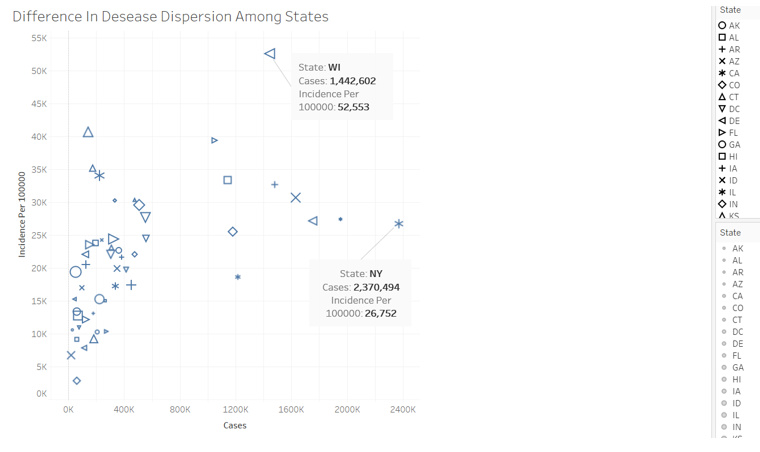
Hi all, I was wondering what your opinion was on this data visualisation issue I was having. I’ve created a scatter plot to check for edge cases in disease dispersion in the united states using data from the Tycho Project.
I’ve been looking through this reference material for ideas: https://www.oreilly.com/library/view/designing-data-visualizations/9781449314774/ch04.html
My current design has mapped ‘state’ to both ‘size’ and ‘shape’ using Tableau, as I think this makes it easier and clearer to visualise which state is where on the graph. However I’m not sure if it’s bad form to map state to both size and shape or if I should just choose one of them. Here’s my current scatter plot, any advice is greatly appreciated!


