Good Afternoon,
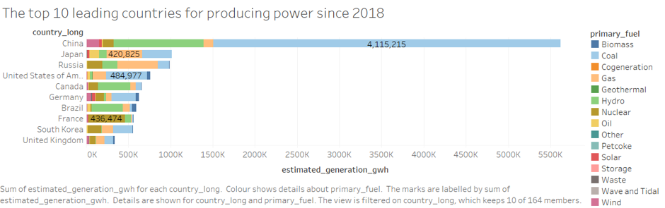
I created a stacked bar chart to show the top 10 leading countries for generating power in (gwh). I also included the percentage of what each fuel type generated for each country.
Image:
Visual Design Type: Stacked Bars
Name of Tool: Tableau
Country: Top 10 leading countries for producing power: China, Japan, Russia, United States of America, Canada, Germany, Brazil, France, South Korea, United Kingdom
Year: 2018
Visual Mappings:
X-Axis: SUM(estimated_generation_gwh)
Y-Axis: country_long
Colour: primary_fuel
Label: SUM(estimated_generation_gwh)
Detail: country_long
Primary_fuel
SUM(estimated_generation_gwh)
Filter: County_long
Unique Observation: China dominates in the generation of power in the world. With roughly 70% of the energy obtained from coal and roughly 20% being renewable. The second leading country for producing power is Japan. China produces 5.5 times more power than Japan. Japans leading power type is Gas. Russia comes shortly after Japan, with a short of 27,536 GWh. Russia makes most of its power from Gas. In 4th comes United States of America with coal being its primary fuel type. Followed by Canada with roughly 60% of its power being produced by hydro. Then Germany with Coal being it’s primary fuel type. In 7th is Brazil, with roughly 63% of its power generated from Hydro. In 8th is France with roughly 78% of its power generated from Nuclear. Then in 8th and 9th place we have South Korea and United Kingdom.
Brazil and Canada are doing very well on using renewable power fuels to produce energy. Roughly 73% of Brazils power production comes from a renewable source and Canada being 63%.
Data Observation: Filters applied to Stacked bar chart to remove null values and restrict the amount of countries shown
Questions:
Is it okay to restrict the number of countries to the top 10 countries in producing power. Are there any benefits in showing all the countries in descending order?
Is a stacked bar chart the best way to present this title. Is it clear enough? Should I include more information?
How can my visual design be improved?
Source To Dataset:
Global Energy Observatory, Google, KTH Royal Institute of Technology in Stockholm, Enipedia, World Resources Institute. 2018. Global Power Plant Database. Published on Resource Watch and Google Earth Engine;
URL: Global Power Plant Database - Datasets - WRI ODP
Thank you very much for taking the time to look at my graph!