Data set:Global Power Plant Database - Datasets - WRI ODP
Image:
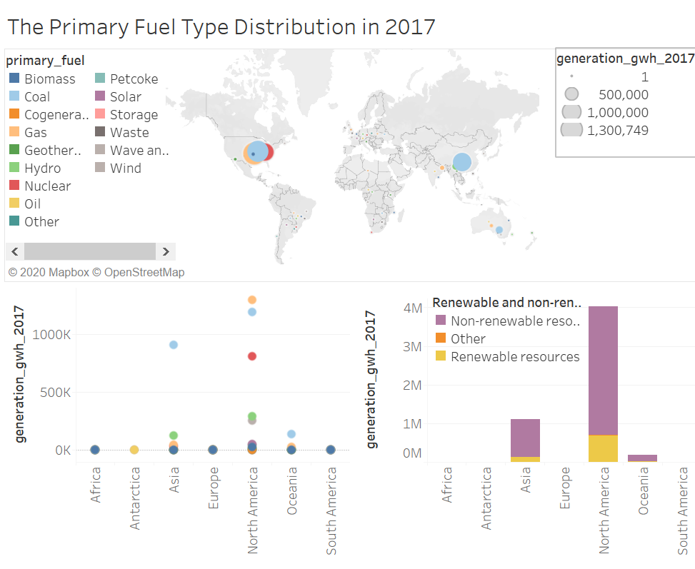
Visual Design Type : Maps + Circle view + Bar chart
Name of tool : Tableau
Country : Seven continents
Year : 2017
Visual Mapping : Map:
Color - primary_fuel
X-Axis, Y-Axis - Latitude, Longitude
Mark - Circle
Size - generation_gwh_2017
Detail - continent
Circle view:
X-Axis - generation_gwh_2017
Y-Axis - continent
Color - primary_fuel
Bar chart:
X-Axis - generation_gwh_2017
Y-Axis - continent
Color - Renewable and non-renewable fuel type
Unique observation : This visualization shows the primary fuel distribution of each continent. We can see coal, nuclear and gas are responsible for most of the power plant in North America. The North America is the only one continent who has nuclear resource to generate electricity. In Asia, the coal power plant also accounts for a large number. From the circle view, we can see the North America has the most abundant fuel resources,followed by Asia. Asia’s coal power plant generation is far more larger than other types of fuel. In the bar chart, we can say that most part of the resource used in power plant are non-renewable source type.
Data preparation : I grouped the whole countries into seven continents. In addition, I delivered the primary fuel into renewable and non-renewable types.
Reference : Bauer, R., & Hagenauer, J. (2000). Symbol-by-symbol MAP decoding of variable length codes. ITG FACHBERICHT , 111-116.
Question:
Does my visualization make sense?
Is this an effective way to show the primary fuel type distribution?
How can my visual design be improved?
Many thanks for spending time to viewing this visualization and I am look forward to knowing the feedback!