Hi,
I have created Map, Bar Chart and Treemaps, using Tableau, to demonstrate the information about the power plant in Thailand which show the amount of each capacity and estimated generation growth (in Mw).
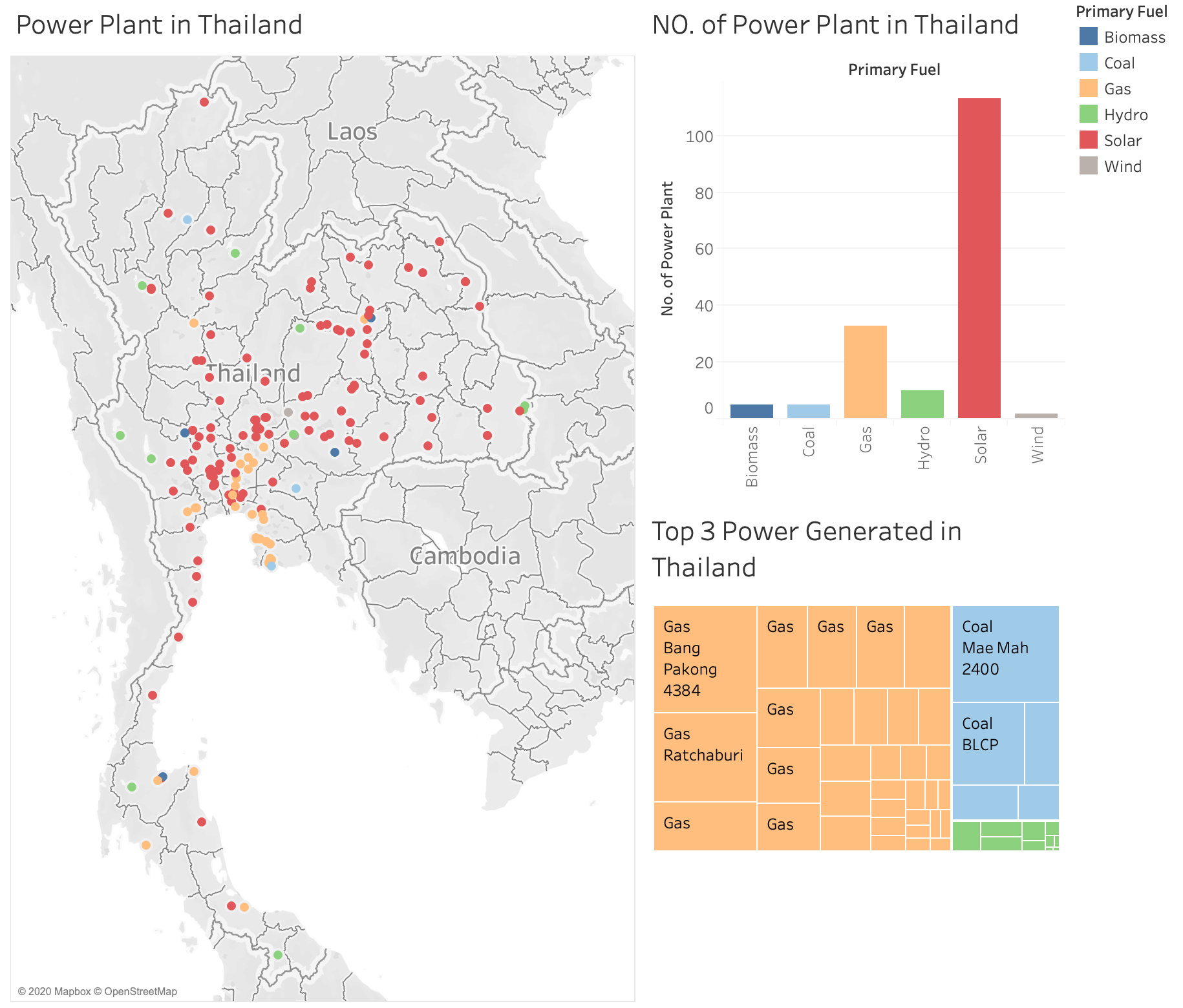
Visual Design Type: Map, Bar Chart and Treemaps
Name of Tool: Tableau
Country: Thailand
Year: All available years
Visual Mappings:
Color – Primary Fuel
Map: x-axis – Latitude
y-axis – Longitude
Bar Chart: x-axis – Primary Fuel
y-axis – Count (Primary Fuel)
Treemaps: Primary Fuel
Sum(Estimated Generation Growth Mw)
Name
Capacity Mw
Owner
Unique Observation:
Overall, natural gas is the major power for electricity generation in Thailand. The largest capacity of natural gas plant is located to the east of the country named “Bang Pakong” and produce the most energy in Thailand.
On the other hand, the most power plant is Solar which is located generally at the central and northeast of Thailand.
Data Preparation:
- Filtered country = Thailand
- Increased the circle scale size
- Match the 3 visualization in order to have the same color for the primary fuel information
Data Source: Global Power Plant Database - Datasets - WRI ODP
Questions
Is this visualization clear information? Would you have any other data which I can represent with these? How can my visual design be improved? Are there any other types of visual layouts that would be better for this visualization?
Thanks for your suggestions
kiti_kat