
Guideline: Hello everyone, as a part of my data visualisation coursework, I try to create some interesting and meaningful visualisation of power plant data. This is only one of my visualisations. I want to hear your opinions and suggestions about this visualisation I have tried to present primary fuel distribution around the world and the amount of estimated power generation according to fuel types.
Source : http://datasets.wri.org/dataset/globalpowerplantdatabase
Reference : https://journals.sagepub.com/doi/pdf/10.1177/1473871619858933
Image :
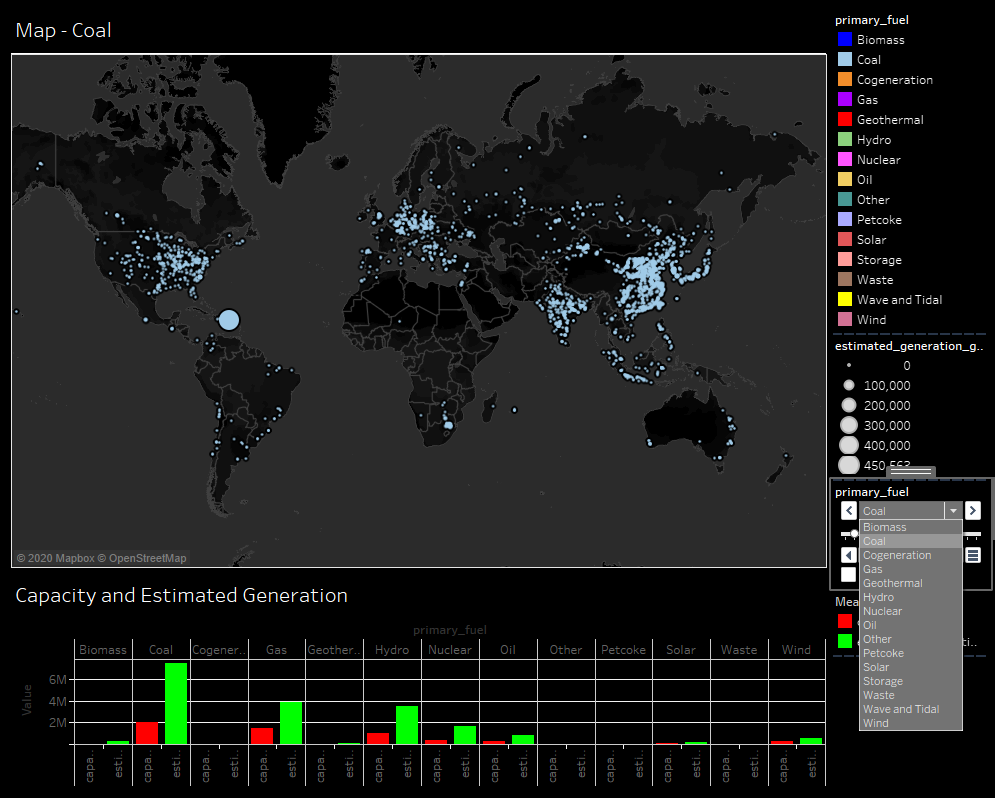
Visual Design Type: Symbol Map with a Bar Chart
Name of Tool: Tableau
Country: All Countries
Year: Whole Years
Visual Mappings:
For Map:
X-axes: Latitude
Y-axes: Longitude
Colour: Colours are based on the primary fuel types.
Shape: Shapes represent each power plant (gppd_idnr).
Size: Sizes of shapes depend on the sum of estimated generations.
For Bar Chart:
X-axes: Primary fuel types grouped
Y-axes: Values of primary fuels grouped
Colour: Colours represent the capacity and estimated generation.
Unique Observation: The distribution of fuel types around the world, the amounts of contributing to power generation of fuel types are clearly seen from this visualisation. We can use the combo box located on the right side of visualization to see the distribution of primary fuels separately. The chart located the bottom of the visualisation present that estimated power generation according to fuel types, and their capacity.
Data Preparation: To obtain this visualisation, null estimated generation values were ejected.
Question: Is this design sensible for my aim?
How can I improve my visualisation toward my aim?
Are my colour and background choices ideal?