Question:
http://datasets.wri.org/dataset/globalpowerplantdatabase
I would like your professional opinion on my visualisation:
- Does my visual design make sense?
- Is symbol map efficiently used and if so does the filter used clears distinct information?
Visual Design : Symbol Maps
Name of the tool: Tableau (Online)
Name of the Country: All Countries (All Geo-location Countries)
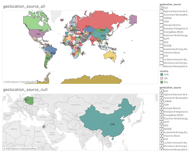
Null Geo-location Source Countries- China,Israel,Poland
Year: NA
Visual Mapping : X-axes : Latitude ; Y-axes : Longitude
For Geo-location All Sources: Different Colour represent different geolocation sources.
For Null Geo-location Source : Three special Countries China,Israel,Poland as shown.
Unique Observation:
China,Israel and Poland are the countries which are having null geolocation sources. This indicates, these countries do not reveal about most of their resources.
Data Preparation:
Applied the filter for Geo-location Sources,where we are getting all the sources around the world.But It was found China,Israel and Poland are not having any such geolocation sources.

