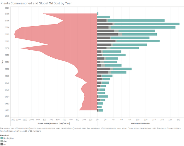
A butterfly chart.
I’ve found butterfly charts are often employed to show population data but I have adapted mine to show the relationship between the global price of oil and the number of power plants constructed.
This was created in Tableau, and shows both global average crude oil prices, and global power plant construction over the last 30 years.
Time is being represented on the y axis, and I’ve opted to put the newest data at the top of the graph. The area under the left hand chart shows the cost of oil, while the length of each bar on the right hand graph is the commission rate of power plant construction.
Color has also been used to distinguish plants built to use oil (and gas) and others which understandably would respond differently to the cost of oil changing.
To my surprise, the incresing cost of oil is reflected in an increase in oil power plants. This was surprising and the inverse seems to be true as well.
This data this graph was constructed from is a combination of the data availible at: Global Power Plant Database - Datasets - WRI ODP to get power plant comission dates and the data at: Crude Oil (petroleum) - Monthly Price - Commodity Prices - Price Charts, Data, and News - IndexMundi to get the cost of oil over the last 30 years.
I would like to investigate this relationship better, particularly by adressing the effect of inflation on the cost of commodities. While I could simply adjust the price on the left to reflect inflation is there a way I could display price adjusted for inflation on the left axis while still being able to reference the original cost data? I worry a simple stacked area chart would be too difficult to interpret on a butterfly graph.
Many thanks.

