Hello, I have been working on a binned scatterplot visualisation of a power plant dataset. I am attempting to use a binned scatterplot to highlight trends in the capacity of a power plant and its corresponding distance from other energy producing facilities. Below is a screenshot of my current design:
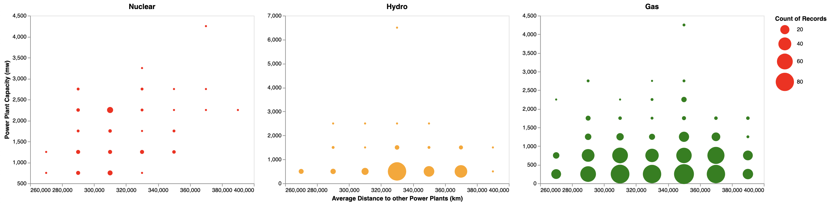
The graphs shows data for power plants located in the United States of America. Each graph plots a different fuel type (nuclear, hydro and gas respectively) and shows the relationship between a plants capacity (mw) and its distance (km) from other energy facilities (taken as the average distance from all other power plants in the United States). This visualisation was created to test the hypothesis that larger powerful plants (greater capacities) are located geographically further from other power facilities. Specific visualisation details:
-
Design type: Small multiples binned scatterplot
-
Tool: Altair
-
Country: United States of America
-
Data timespan: 1900-2018
-
Axis: Average distance to other power plants (km) is plotted on the x axis with Capacity (mw) plotted on the y axis
-
Colours: Each fuel type has a colour associated with it (Nuclear = red, Solar = yellow, Gas = green)
-
Size: The size of a binned scatter plot circle represents the number of facilities it accounts for, with larger circles corresponding to a larger number of facilities.
-
Observations: The graphs allow for trends to be identified for each fuel type. The use of small multiples allows for direct visual comparisons to be made. For example we can see that Nuclear plants show a trend along the y=x line supports the hypothesis that a higher capacity typically corresponds to a higher average distance.
-
Data preparation: To prepare the data I used python to manipulate the structure to the desired format and then apply a custom function to calculate distance using longitude and latitude. The dataframe was then split by fuel type and plotted as 3 combined binned scatterplots in Altair.
I want to further expand the design and allow for user interaction that will enhance the visualisation in a meaningful way. I am currently working on adding tooltips, I am looking for suggestions of data to include in the tooltips as well as general feedback.
Thanks,
Josh.
References:
- Tamara Munzner, Marks and Channels.
- Shneiderman’s Mantra, Ben Shneiderman.